Associate Director Mariusz Wróblewski talks about the transformation of Forum Gliwice in Poland
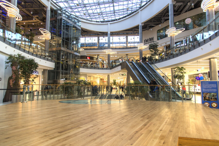
The ten-year-old Forum Gliwice shopping centre has been transformed inside and out, with nearly all public areas being refreshed. Movement through the centre has been improved by changes to the common areas. A stair landing in the atrium was removed to allow installation of a stage area which is to be the home of events and artistic performances, providing a focal point for the centre. Chapman Taylor’s Warsaw studio provided the concept and full design services for this much-anticipated transformation of the Forum Gliwice shopping centre, with work on the building exterior still to follow.
Associate Director Mariusz Wróblewski spoke to arch. Ewa Kaszuba-Nawrocka of lighting design specialists LUG Light Factory, who provided interior lighting services for Forum Gliwice, about the design inspiration and key challenges faced in renewing the centre.
What inspirations and factors influenced the architectural solutions of this building?
The main factor determining the solution was the fact that we were modernising the existing form of the centre, and this required us to consider the context. This shopping centre, designed by ArKuS Biuro Projektowo - Doradcze Marek Gachowski, opened in 2007 and was built on the former factory site, Gliwickie Zakłady Materiałów Ogniotrwałych, in the area around Traugutta, Witkiewicza, Opolska and Lipowa streets. This was the first large commercial facility in Gliwice, one of the fastest-developing cities in the Upper Silesian agglomeration, with 200,000 inhabitants.
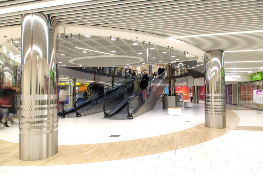
When we started to prepare the design proposals in 2014, we had some basic problems to solve. The 43,000 m² of space, including 140 shops and service outlets located in the centre, didn’t only require material and technical modernisation; we also had to redesign the common areas and the public toilets, and remodel the internal circulation, to improve customer flows within the centre. That’s why we incorporated new escalators and travelators in the design.
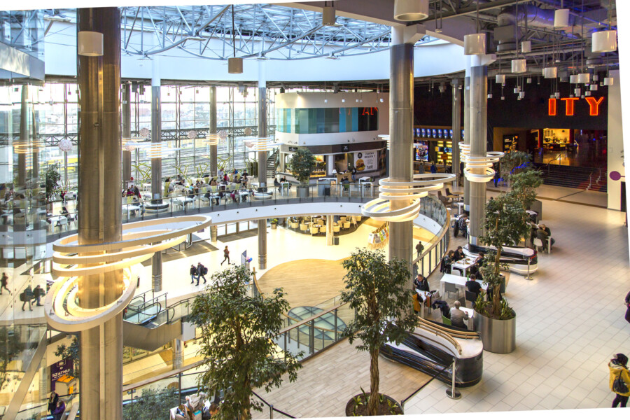
In the atrium, we got removed the open stair half landing and replaced it with a multifunctional partially glazed platform in the shape of ellipse. This stage space is now at the heart of all events and performances. One of the basic things that we also had to improve was the lighting, which wasn’t just about converting conventional fittings to LED. The centre is glazed in many places and it also has a large skylight above the atrium, which provides a lot of daylight. Unfortunately, some areas were underexposed to natural light in the early evenings and on cloudy days. Our design solution increased the amount of light in a way that did not significantly change the original design assumptions and installations.
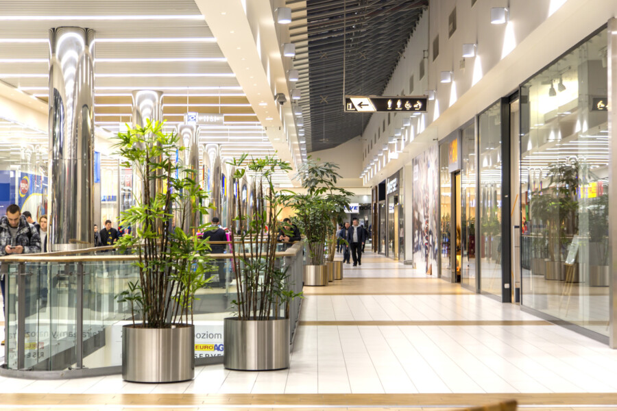
When selecting interior finishing materials, we focused on materials such as composites, architectural mesh, stainless steel and wood. Mirrored column cladding reflects light in an effective way, and timber-like floors warm up the interior. New, open lamellar ceilings (a combination of snow white and warm wood), interlaced with openwork strips of metal mesh together with linear light strips embedded within them, introduced rhythm and order to the irregular line of malls.
From the architect’s perspective, what was the biggest challenge in this project?
The most difficult challenge was how to reconcile several different guidelines, the necessity of incorporating new technologies into the existing building and a few non-standard solutions that were made specifically for the needs of this project – for example the small architectural items and the internal fittings, referenced and inspired by the oval, elliptical shape of the atrium and the above skylight. This motif was repeated in various elements of the project as a distinguishing feature – in the geometry of the stage, benches, elements of visual identification and the Food Court purpose designed light fittings placed on the pillars. The co-ordination of the project, in which we implemented new and bespoke solutions instead of ready-made catalogue products, was an additional challenge for us as architects. It was crucial to find the right partners for the project.
Have you met the client’s requirements for refurbishment and refreshment?
Absolutely, yes. We completed the goals that were set before us. The building now has a unique design decor and has been adapted to the requirements of today. This modernisation has received excellent user ratings and we have positive references, which makes us, and the client, very happy.
More about the work of LUG Light Factory can be found here.


