Project Profile: Designing MediaCityUK’s Tomorrow building to meet the needs of media and digital creatives
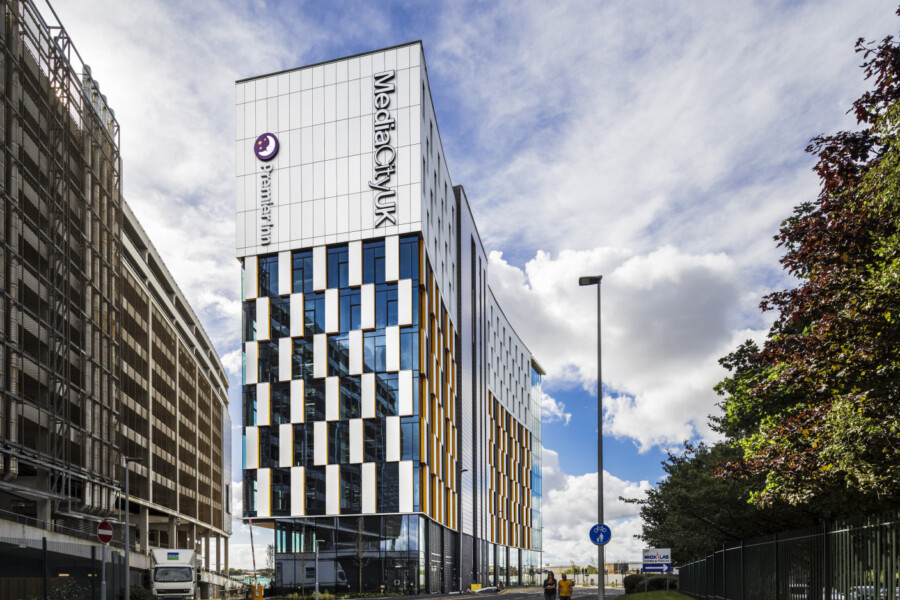
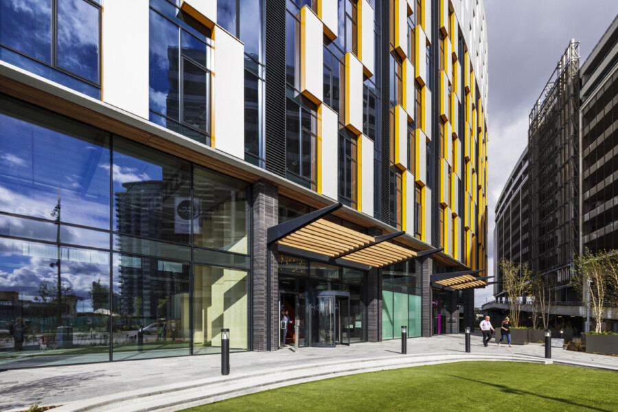
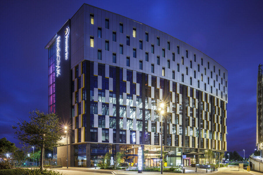
Tomorrow at MediaCityUK in Manchester is a sustainable, low-energy, mixed-use building which provides flexible office and co-working space for the digital media, technology and creative industries. Provided with world-class connectivity (awarded a Wired ‘Platinum’ score), the building is flexible and responsive to the changing needs of occupiers, while providing a fun, vibrant working environment. The upper levels of the building contain a 112-bed Premier Inn hotel, which has a separate entrance at ground floor along with bar and restaurant facilities.
Chapman Taylor Director Andrew Carroll, who worked on the scheme from the early stages through to completion, spoke to us about the origins and evolution of the scheme, explaining why the innovative, BCO Award-winning building design has provided a striking and very popular gateway to MediaCityUK.
Tell us about the project brief you received for the Tomorrow building.
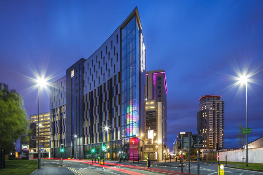
The Tomorrow building was the last piece of the phase one works to be completed at MediaCityUK. The brief from our client, Peel Media, was to create a gateway building to MediaCityUK. This meant that the building had to be of an excellent architectural quality, serving as a fitting visual entry experience for visitors and setting the tone for the rest of the development.
The brief was to create a non-corporate, flexible and fun environment, reflecting Peel's vision of the evolving nature of workplaces. The target tenants were to be from digital, creative and media-related organisations which would complement the wider MediaCityUK profile – so a more informal space was considered the ideal format.
The building had to be environmentally sustainable, in line with the rest of the MediaCityUK estate (which won the world’s first BREEAM Excellent Communities Award) – we designed Tomorrow to be a low-energy, naturally ventilated building with a BREEAM Excellent rating. The brief also required that we incorporate cutting-edge technology and facilitate the building’s use by tech-savvy businesses, which led to the building achieving the score of Wired ‘Platinum’ – a major selling-point in attracting new tenants.
Crucially, the building had to deliver value for money – there was a limited budget, and we were required to think creatively about how we would develop a design that would meet the needs of the target demographic and which was appropriate for a gateway building to MediaCityUK.
Why did Peel come to Chapman Taylor, and what was Chapman Taylor's role?
Around 80% of our work comes from repeat business and we have been lucky enough to have worked with Peel on many of their high-profile projects in the past. We were part of the team that delivered MediaCityUK Phase 1. We were also the masterplanners for Phase 2 and led the team for the RMA application, which was approved in 2016.
As with all of our clients, we never take this relationship for granted and we continue to focus on delivering creative, commercially viable designs and the best possible service.
Chapman Taylor was responsible for all aspects of the architectural design from concept through to completion, including the interior design. Following planning approval and the development of the detailed ERs, we provided Client Design Monitor services for Peel Media. We also provided a separate team that was directly appointed by the main contractor, Bowmer & Kirkland, for the delivery stages of the project.
The design was modelled in BIM using Revit, with all designers preparing their work for inclusion in the federated model, hosted by Chapman Taylor. This process meant that the design was fully coordinated and, therefore, we were able to focus on quality of the installations on site.
Describe the challenges you faced in developing the design.
The site is a very tight, triangular shape and the proximity to the MediaCityUK energy centre made construction tricky, requiring a very efficient design that worked for both the office floorplates and the hotel levels above while avoiding below-ground services and obstructions.
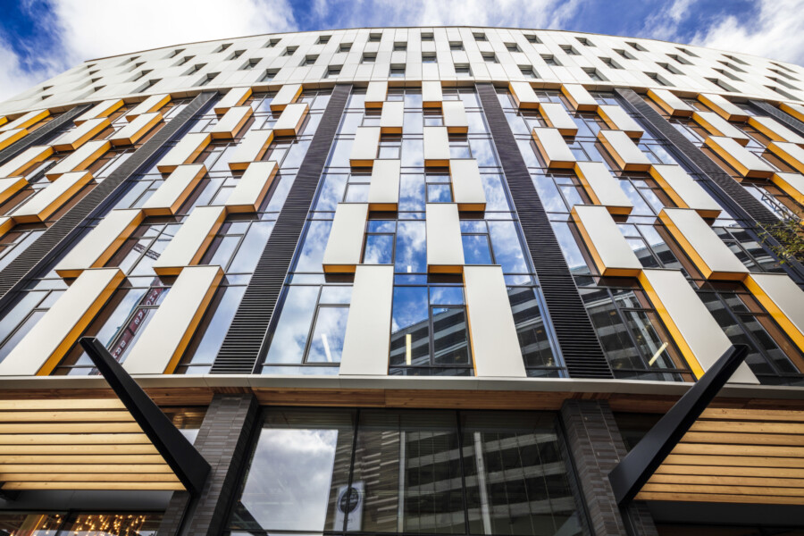
The prow of the building extends to a point at the corner of the site and creates a focal point at the gateway to MediaCityUK. There is an LED lighting/signage system within the prow that can be used for events and announcements within the estate. The façade design of this element was a real challenge, particularly to achieve a striking cantilever while creating a structural solution that was elegant enough to be exposed.
It was also a challenge to build in flexibility and future-proof the building. This required a lot of thought about how the building could be made adaptable to possible changes, and about what those changes might be. The design is all about flexibility – allowing for different configurations of the floorplates, additional services and easily adaptable spaces that can evolve through the lifetime of the building. We even developed the design so that a full heating/cooling system could be installed, should a tenant require it, while minimising the amount of disruption required to install it. This included future-proofing the façade, service risers and roof spaces for tenant plant.
We wanted to challenge the norms of office design and inform the debate on the future of offices. We held many workshops with the client team to constantly test and question the brief, and held regular design reviews. Our having won the BCO (British Council of Offices) 2017 Regional Award for “Best Commercial Building”, and being “Highly Commended” in the National Awards that same year, with a non-BCO compliant building, is testament to this process.
How did you approach the design for the offices and common areas?
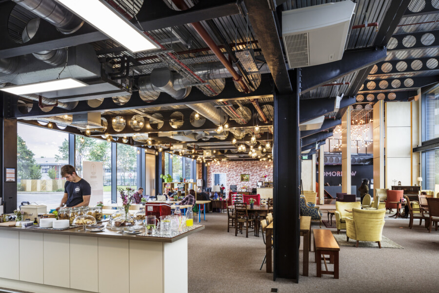
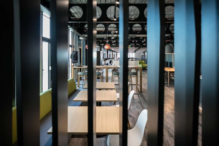
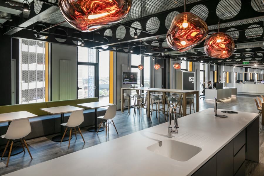
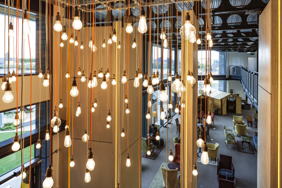
We wanted the ground floor to be used by people and businesses from across the MediaCityUK community, not just by tenants of the building. The intention was for it to become a hub in which people from the creative and media industries could meet and collaborate. It is now a co-working space in which members can work, meet and socialise. It suits the kind of businesses occupying Tomorrow because they are able to use the space in an agile way that does not tie them into a long-term commitment. This is critical to the type of businesses that we were targeting in Tomorrow, as the nature and use of technology is continually evolving and changing the way we work and how we use our office spaces.
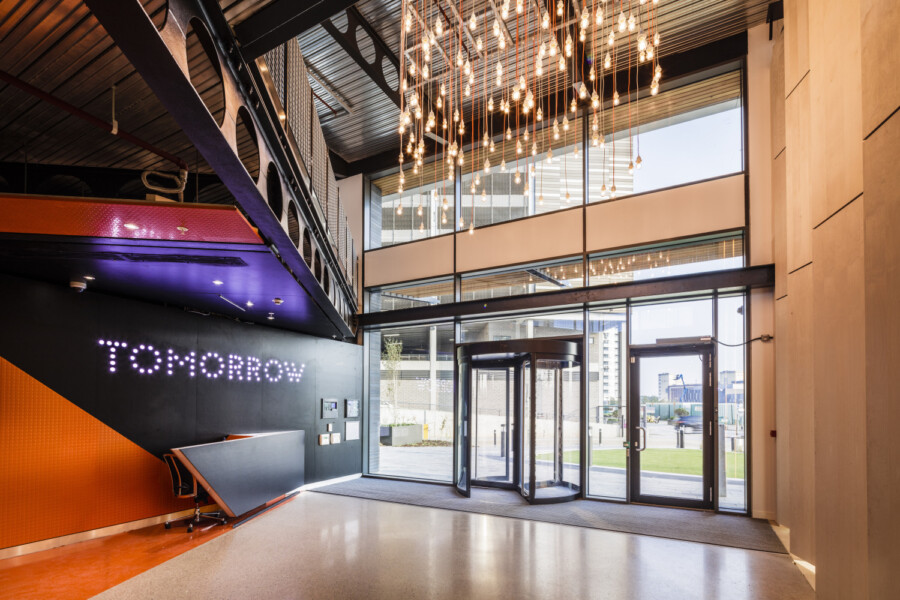
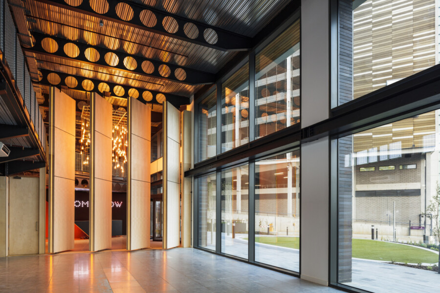
We didn’t want a traditional ground floor entrance reception with someone sitting behind a large desk. The final design for the reception area incorporates 7m-tall, revolving fins that can be opened up to link the reception area with the co-working space and can then be used for events. The fins create a striking feature within the entrance area and incorporate LED feature lighting.
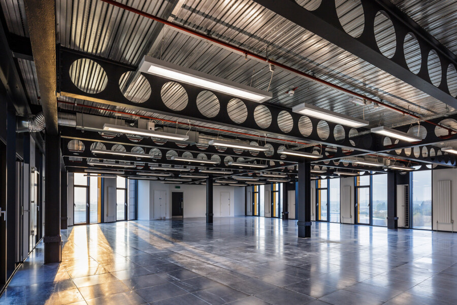
On the upper floors, the office floorplates were designed with the principles of the BCO Design Guide in mind, but we looked to go beyond what is ‘normal’ for office space. We designed flexibility into the core for future expansion, if required, to suit specific tenant requirements. We also used a Fire Engineered Solution, developed in consultation with specialist fire consultant JGA, meaning that there is a bespoke escape strategy that maximises floorplate efficiency and value without compromising the safety of the building’s users. As part of the strategy, the full building is fitted with a sprinkler system which is monitored 24/7.
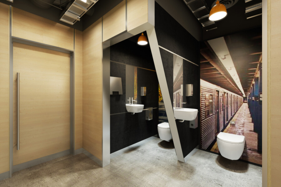
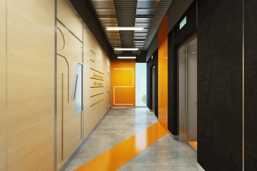
We used a palette of materials that were tactile in nature – such as concrete, birch-faced ply, rubber wall panels – and that were cost effective and hardwearing while being fun and engaging at the same time. The toilets were an opportunity to explore this further; they include individual sounds systems and corresponding graphics that transport the user to different parts of the world and create a bit of fun and a talking point.
Tell us some more about the building’s flexibility.
Our design future-proofed the building by allowing it to be subdivided easily into a range of suite sizes while maintaining a good net-to-gross ratio across the floorplates. The core can accommodate different types and sizes of occupancy within the building – for example, if an occupant wants to extend its space to allow for a call centre, the core can be extended to offer additional staff facilities as required. The MEP strategy was designed to easily split into zones to make modification of the systems straightforward in the future.
The Cat A fit-out was designed to form a backdrop to the tenant’s Cat B fit-out, avoiding the need for expensive modification works and enabling the tenants to move in with more of a ‘plug and play’ approach, where they can install their IT/comms equipment and furniture and start work straight away. The ease of the fit-out work speeds up the process of moving in and helps to reduce overall costs for the tenant.
How did you ensure that the building was energy-efficient?
The building is connected to the site-wide tri-generation system, which provides very energy-efficient power, heating and cooling to the whole site. The innovative system uses a series of plate heat exchangers to turn waste heat into energy, and uses canal water to assist the cooling system.
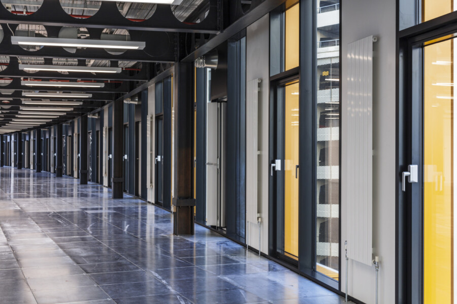
The building was designed to be suitable for natural cross-flow ventilation, which gives occupants control over their environment and improve their sense of wellbeing in the space. The bespoke design, developed with MEP consultant Aecom, achieved a CIBSE ‘A’ rating for the overheating criteria in naturally ventilated buildings. This is the best performance that can be achieved for a naturally ventilated building.
The insulation properties of the materials used for the building’s external fabric, and the quality of the glazing, particularly in terms of reducing solar heat gains, were key components in achieving BREEAM ‘Excellent’ certification. LED lighting is used throughout, and there is programmable, sensor-led daylight control which can be adjusted by the tenants to suit their local lighting requirements.
Who are the key tenants now?
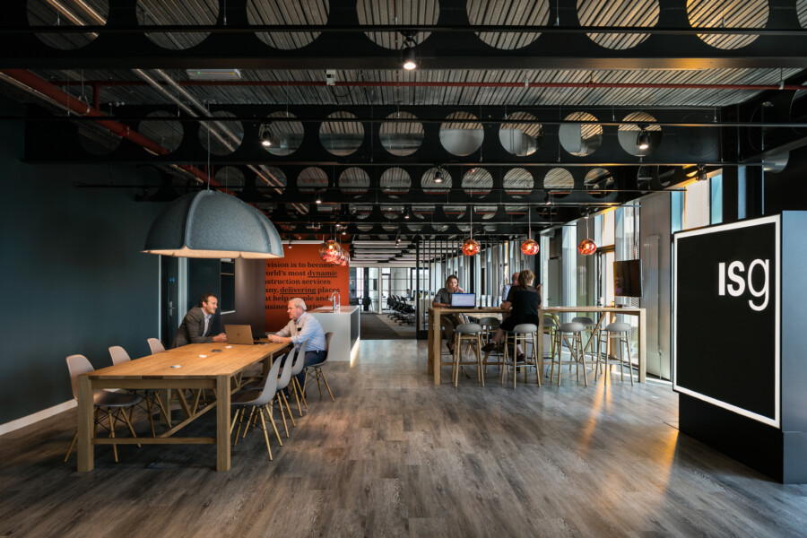
As well as Premier Inn, other tenants include the digital media companies Carbon Creative and Fuzzy Duck, the advertising agency Zeal Creative, Beckitt Renckiser, audio production company Audio Always and internet service provider Global Capacity. ISG Construction moved its North-West headquarters to the fifth floor and commissioned Chapman Taylor to design its fit-out, which has been a great success. The fit-out creates created a dynamic office space that promotes the core values of the company.
What has been the feedback from clients and end-users?
Peel Media is very happy with the end result – Tomorrow has met the goals of being sustainable (BREEAM Excellent for both the offices and the hotel), being good for wellbeing through the use of natural lighting and ventilation, being a landmark gateway building, offering world-class technology and being future-proofed to cope with the ever-changing needs of tenants and other users.
We also received excellent feedback from tenants, of a sort we wouldn’t normally expect for a commercial office building – Carbon Creative, for example, looked at a number of spaces across Manchester, but the Tomorrow building, in their own words, ‘tugged our hearts’. Audio Always told us of how they appreciated the building’s flexibility, which allowed them to accommodate their recording and production facilities, as well as the collaborative spaces and hot-desking at the ground floor – giving them different options for how to work and helping them attract staff.
Tomorrow has a great buzz now, and feels like a community. It’s an attractive building, and slightly quirky. It was great fun to work on because of the opportunity it offered to explore a different way of designing, and we are very proud to show people around it.
Key facts:
Sectors: Office, Hospitality
Services: Architecture, Interiors
Client: Peel and L&G Partnership
Area: 9,360m2 GBA
Status: Completed in 2016
Key Award: Winner of the BCO Northern Awards – Best Commercial Office category 2017. Highly Commended at the BCO National Awards in the same category.
