Project Profile: The truly authentic, urgently needed regeneration of Coventry City Centre South
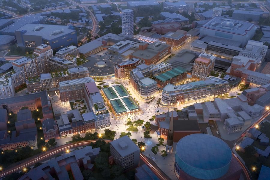
Shearer Property Regen Ltd. and Chapman Taylor submitted a planning application for our transformative City Centre South urban regeneration masterplan for Coventry in December 2020. City Centre South will upgrade several areas of the historic heart of Coventry, including Bull Yard, Shelton Square, City Arcade and Hertford Street, and will make the city a significant residential, shopping and leisure destination in the West Midlands. The aim, should planning permission be granted, is to have the development open by 2026.
In this Project Profile, Associate Director Daniel Morgans explains the key principles behind the project, its urgent importance for Coventry and the way in which the development will combine the best elements of Coventry’s past and present to create an authentic, socially and economically sustainable space for the people who live, work, shop and socialise in the city.
Tell us about the background and context for the Coventry City Centre South project. Why is fundamental change required?
City Centre South is an area of wonderful strategic potential because of its position between Friargate / the railway station and the successful Broadgate area; it sits both on the route between the railway station and the city centre and on an east-west axis with Coventry University. Coventry is growing in population, with major automotive and industrial plants such as Jaguar Land Rover as well as a diverse student population.
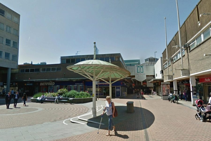
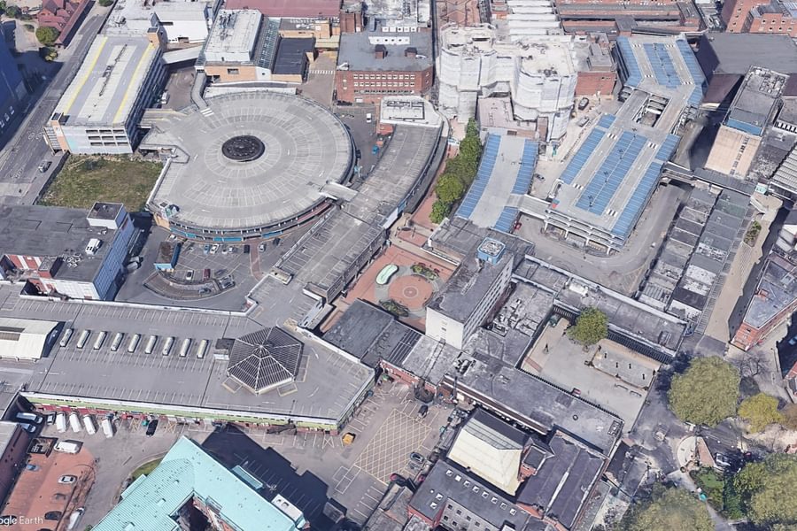
The historic street pattern of Coventry was interrupted by badly conceived post-war planning, which had a number of failings, including the imposition of tower blocks in the middle of the street, poor urban legibility and damaged or blocked views. Meanwhile, the best, most elegant post-war architecture was itself undermined by insensitive additions between the 1970s and 1990s.There is too much bad architecture and a reliance on outdated retail concepts, such as inward-looking arcades, rooftop parking, huge service yards and multi-storey car parks.
The over-reliance on retail, which accounts for over 90% of the area’s offer, means that the area will decline very sharply if nothing is done to introduce new uses and new functions. To put it bluntly, the city centre will die, socially and commercially, if it is not transformed.
What tackling that means in practice is restoring the traditional functions of the city centre – markets, socialising, working, living, etc. – not just creating another bland, identikit retail street. There should be a vibrant night-time economy and a reason for people to want to come in to the area rather than sit on their laptop at home or go elsewhere. There needs to a fundamental restructuring of the very purpose of the city centre to prevent it suffering long-term decline.
Our design for Coventry City Centre South remedies the mistakes of the past, which doesn’t necessarily mean everything post-war, while respecting the best elements of the area’s heritage and reinstating a permeable street pattern. Our concentration is less on the architecture than on urban renewal – the urban fabric and street patterns.
What was the brief for the new scheme, and what are the key elements of the proposed renewal programme?
Together with our client, Shearer Property Group (SPG), we were selected by an OJEU process in 2016, with SPG being awarded preferred developer status, with the right to develop the land with backing and funding from the West Midlands Combined Authority and Coventry City Council. The brief was to create a new mixed-use quarter to correct the area’s over-reliance on retail and to become home to a sustainable mix of people and functions.
We analysed the city centre at a very detailed level, looking at the historic street patterns and architecture, where mistakes were made, where new vistas should be opened up, where existing routes can be reinforced and historic axes reinstated (particularly Market Way and Hertford Street, Friargate to Warwick Row and the Reform Club and an east-west connection from The Butts, through Salt Lake Car Park and on to the university). On the basis of those axes, the surrounding street pattern nearly designed itself.
The massing required sensitivity to the existing buildings, particularly the heritage buildings, using an appropriate scale relative to the listed buildings and avoiding sudden large step changes in height. Our assessment of the correct building heights was based first and foremost on respecting existing views from key points in the city to the city’s three historic spires.
What are the key uses envisaged for the quarter?
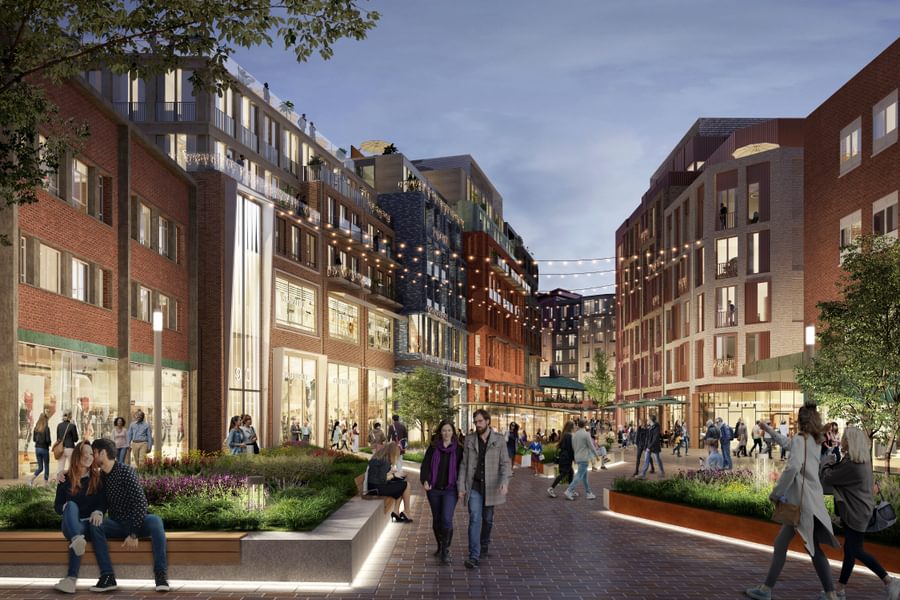
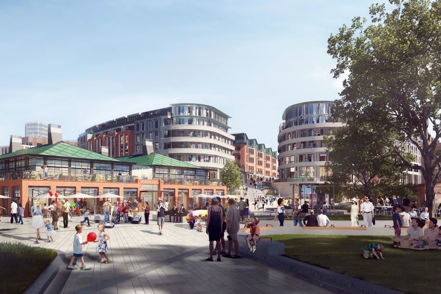
Among its provisions, the greatly improved urban environment will include new residential apartments at the upper levels, new public spaces, new retail units, F&B and leisure and community uses to activate the street level. A curated pavilion building will stand in the heart of a new plaza, which will be fronted by the city’s listed and much-loved indoor market. A new hotel, medical centre and cinema will complete the rounded offer.
The proportion of retail is to be brought down from c.90% to c.15%, with the dominant new use class being residential, at 69%. A substantial residential presence in the city centre will bring about a number of benefits, including being a source of evening activity, which was historically always the case before the mid-20th century. There will also be leisure and entertainment as well as workspaces, hotels and civic amenities such as a medical centre. It is important to emphasise, however, that retail remains a crucial role in the success of urban centres, particularly independent retailers, who can help to restore a sense of authenticity and a unique identity to town and city centres.
There will be a lot of new public realm space, providing a very attractive home for curated leisure and entertainment and an anchor pavilion building which will be a hub for artisan and independent retailers and F&B at the upper floors. In essence, the development creates a lively public plaza which is well connected to the rest of the city, with Market Way and Hertford Street passing through it.
At the moment, the public space comprises barely connected elements, such as Shelton Square, Bull Yard and Hertford Street, barely interacting with each other. Our design brings these spaces together around a unifying focal point, the new pavilion and the plaza. 80% of what we’re removing is an unattractive and impermeable, most created not in the post-war period, but long after, in the 1970s-1990s.
How does the design draw on Coventry’s history and context without creating a pastiche?
We are very consciously avoiding a direct response to the best post-war architecture – we believe it should be respected, and that the best way we can respect it is to neither touch it nor to try and replicate it. Instead, we have drawn inspiration from the streets’ visual culture, the broken-up façades, the varied rooflines and the industrial feeling of the pre-war façades.
Coventry’s post-war planning was primarily the vision of the then City Architect Donald Gibson (who began planning the renewal of Coventry even before The Blitz in 1940). The architecture, in Gibson's words, was to be "fresh, clean, bright and modern", the influences being the likes of Le Corbusier, Gropius and other modernists. There are several examples of very good post-war architecture, with nice proportions and understated elegance. We will protect and clean up the best of those buildings, which we believe should be an integral part of the urban fabric.
However, Gibson was much more interested in the urban grid and its axial geometry – architecture was of secondary importance to him. The importance of the buildings to Gibson lay much more in their part in the overall urban geometry than in their façades, which were not particularly noted at the time, with perhaps one or two exceptions. The additions of the 1970s – 1990s completely undermined Gibson's principles, with whole areas turned in on themselves, cut off or just made plain ugly. Our scheme works to correct this, removing insensitive additions just as we did with the "Elephant's Trunk" escalator leading to West Orchard.
Much was built to satisfy the dominance of motor cars, including whole swathes of the area given over to parking, even on the rooftops. The much-loved Circular Market is almost completely shut off from Market Way and stares into an enclosed service yard – you have to walk through an inconspicuous tunnel and through a service yard to get to the market from Market Way. The experience is not in line with modern expectations of city centre environments.
Photographs and sketches from before this time show a vibrant place full of market stalls and lovely shop awnings, people living above shops, varied roofscapes – that is what we are trying to achieve, not through a pastiche, but through a completely new space which combines that character and approach with the needs of Coventry now. We’re teasing out a sense of character which suits the city, which is a complex mix of medieval, pre-war, industrial and post-war.
If you look at old photographs of the area, there is a very interesting mix of façades, heights, pitches and proportions, with rounded corners and an active street level. In comparison, those same places today are dull and depressing, with little visual interest or vibrancy, and do not represent an authentic Coventry. Our design aims to restore the spirit of historic Coventry, including its mix of functions, the interaction between buildings and the street, the verticality, the varied rooflines and the fact that people lived right in the heart of the city.
This is a project of great importance to the city – tell us about how you have consulted and collaborated with the city council, business owners, residents and other stakeholders.
We have held a series of private consultations with everyone from business owners, market traders, councillors, the university and local residents. We have also gone out to public consultation, engaging in a series of online workshops with the public. It was vital to us that we both explain our proposals and the reasons they are important directly to the people of the city and that we secured their participation, giving them a sense of ownership of the project.
We have strong backing from Coventry City Council and from Historic England, with whom we have consulted throughout. The important elements for them are that the design preserves key sightlines to the three historic spires and respects the existing building heights and that there are only incremental changes in height between adjacent buildings.
What has the public reaction been?
Overwhelmingly positive – the public consultation saw 62% in favour. The people who live, work and spend time in Coventry want to see our scheme realised because they know it is urgently needed and they can see that it will be a massive improvement in terms of the architecture, the mix of uses and amenities, the spatial improvements and the re-established connections, giving a much-needed boost to the economy and creating a reason to come to, and dwell in, this part of the city.
Written feedback showed high levels of positive support for our design, with comments including:
- “This is an exciting opportunity – let’s build something great!”
- “The sooner this gets started, the better for Coventry.”
- “A place for a future generation to be proud of.”
- “It is what Coventry needs.”
- “It is a shame it will not be completed to showcase the City of Culture.”
- “It is greatly welcome in the city.”
We believe that this project will deliver something truly special for Coventry and look forward to the opportunity to realise it.
