From Sketch to Reality: Associate Director Jonathan Harris on winning new work through effective sketching
Associate Director Jonathan Harris Jonathan Harris joined Chapman Taylor’s Bristol studio in 2016 as an Associate Director. He is a member of our Residential Team and was appointed as Chapman Taylor's Responsible Design Group Leader in 2021. He is also responsible for leading a number of key mixed-use regeneration projects in the Bristol studio. Jonathan has design experience working across a number of sectors including residential, education and commercial offices. With much of his work focused on the early concept and design development stages, Jonathan uses sketching to translate ideas on paper and to develop and communicate his vision. We talked to Jonathan about his drawing process, his not being a naturally gifted sketcher and how clients have been won over by simple and effective sketches.
Where do you start when sketching for a new project? What process do you follow?
I start with the fundamentals, working out how the building or buildings are going to fit on the project site. I tend to work on urban projects, which usually require designs which resolve complex issues such as the relationship between the new buildings and the existing surrounding buildings as well as the wider urban grain.
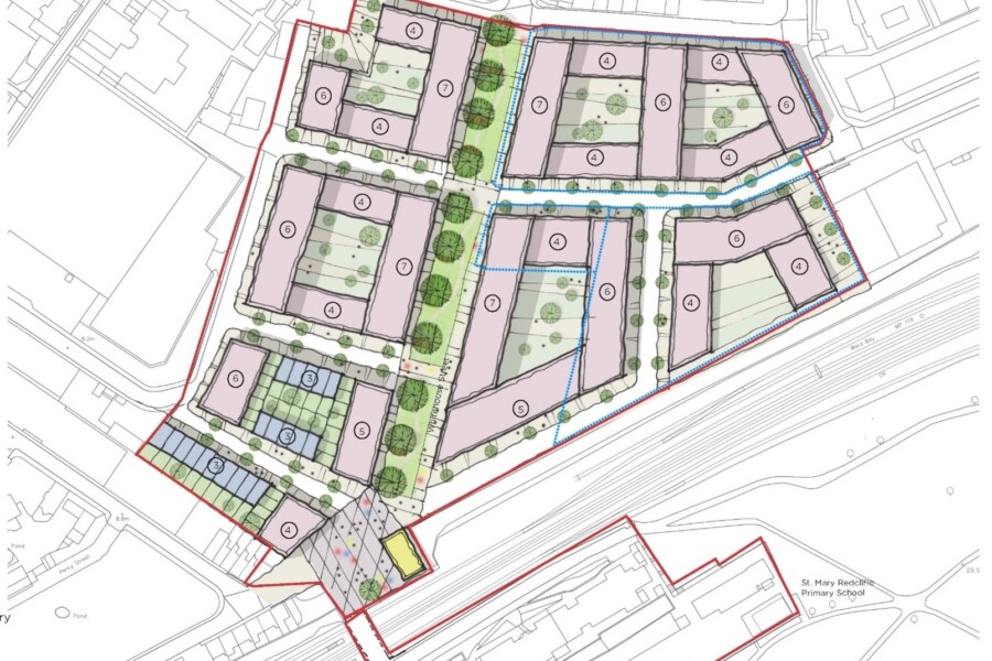
The first thing I do when sketching is to print out an Ordnance Survey map of the location at a 1:500 scale and then, using a fat pen and a scale rule, to start playing with building blocks on the site in terms of their form and orientation, and of the spaces between them. I will usually go through lots of detail paper during this process, which is relatively fast and loose. This, for me, is a very tactile and effective way of getting to understand a site and how the components relate to each other.
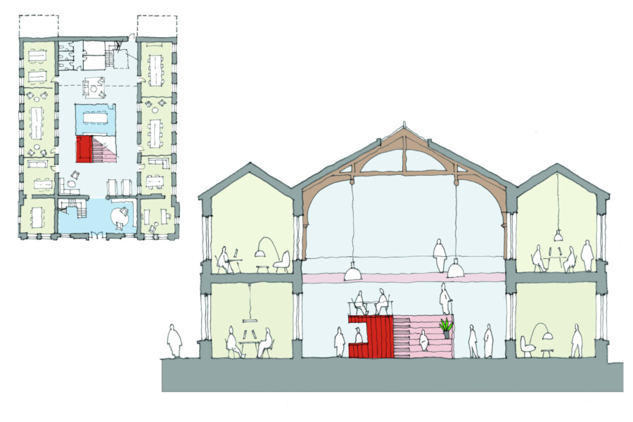
This early stage is something of a release, allowing me to translate the client’s vision and ideas, as well as my own, into something tangible which enables the problem-solving process to begin. After the initial stages, sketching becomes a vehicle for expressing design ideas; I have found that sketching is a very powerful means of communicating ideas to colleagues, clients and stakeholders. I produce a lot of sketches as diagrams because I believe that a good project should have a strong diagram at its heart.
Why are hand drawings a useful design tool for you?
Hand drawn sketches are important because people seem to connect with them in a more visceral way than, for example, with CGIs (although the latter also have an important role). It is particularly noticeable at the end of projects, when visualisations are presented together, whether sketches, CGIs, models, fly-throughs or photographs, because people can then see the creative process behind the design and can grasp the reasons for the evolution of the design in a particular direction.
Sketching can also be very useful for meetings with clients, project teams, stakeholders and others, as a quick and effective means of explaining or exploring ideas. It’s one reason why I believe that sketching is a very important skill for an architect to have, and I often advise younger architects to make use of it. I go by the maxim that, in a meeting, he or she who holds the pen, holds the power; for example, if you are in a client meeting and are the person wielding the pen, you have influence over how design ideas are expressed because your hand is the one translating ideas on paper, allowing you to guide how the design develops to a larger extent. I am not a gifted artist but, through practice and trial and error, and by learning from the work of people I admire, I have developed an effective method and style.
Apart from a fat pen, rule and paper, what tools do you use for the sketching process?
I use SketchUp quite a lot; I will create a basic model of a scene or a three-dimensional form, which I then print out and use as a base to work on and adapt with detail and character. I then add in colour with Photoshop and, often, a layer of shadows from the model as well.
Some of my colleagues are now using tablets to draw, cutting out the stage of tracing and sketching on paper before scanning back in, so everything is done digitally; that’s something I am interested in exploring as a possible means of streamlining the process.
What makes for a good sketch?
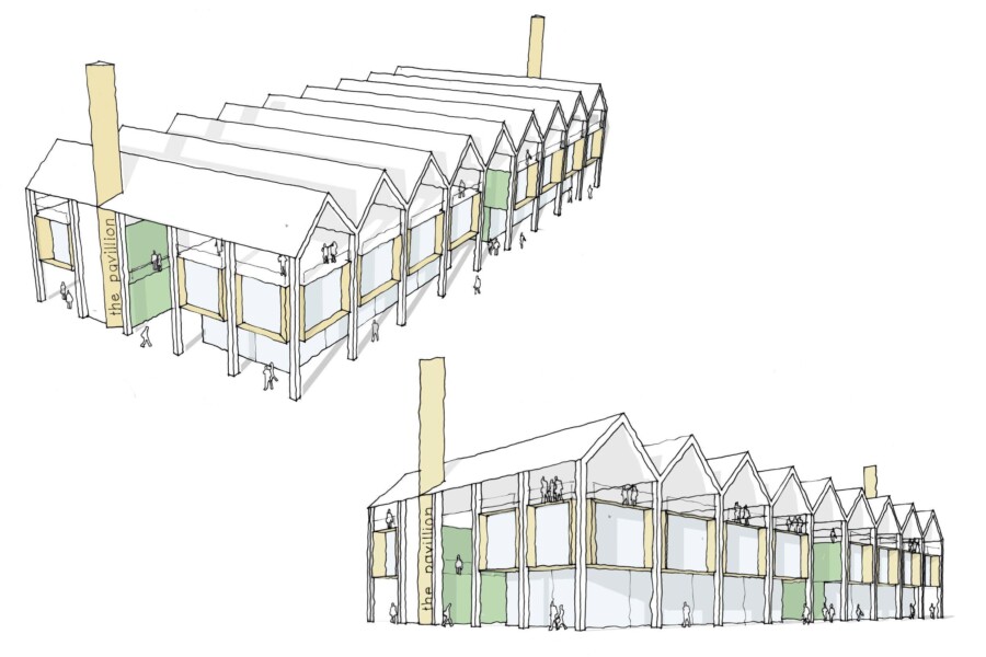
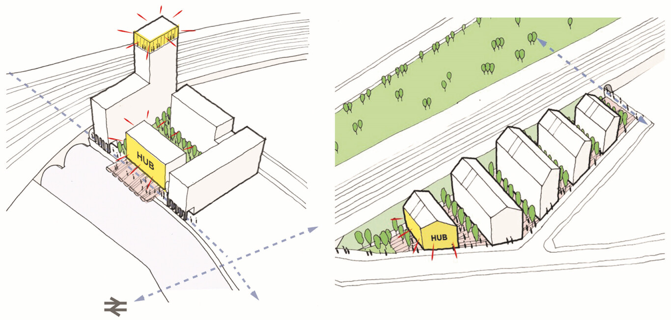
I think simplicity and clarity is crucial, as well as understanding what the message is and how the sketch can best communicate that message. Sometimes that will mean that, rather than a direct visual representation, certain elements are augmented or highlighted to convey the design intent more immediately.
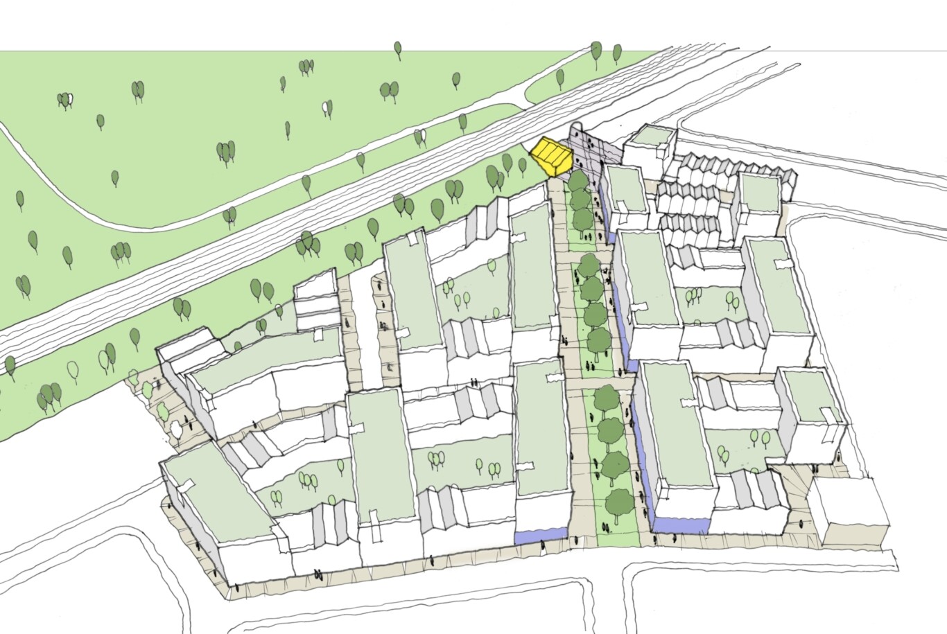
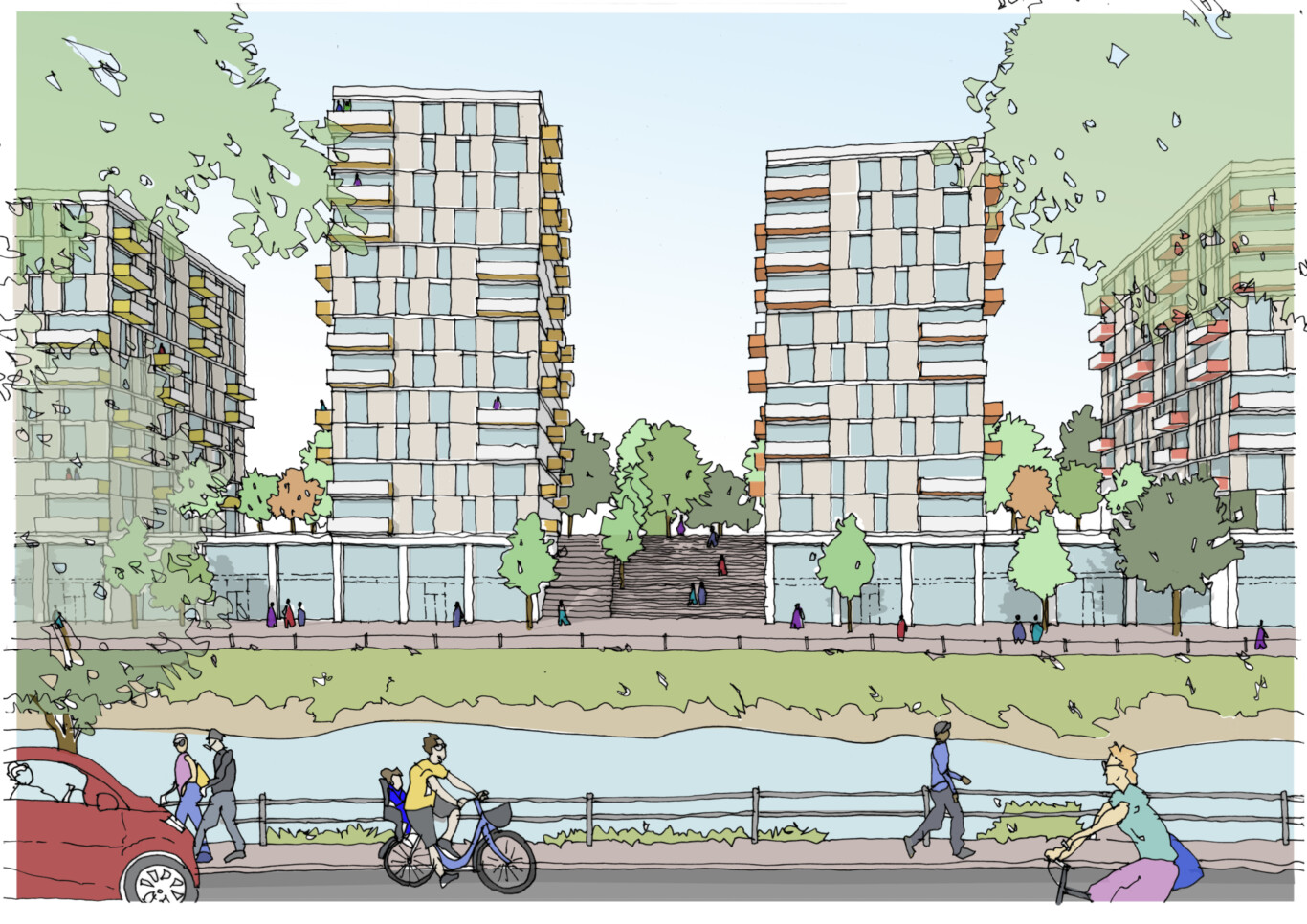
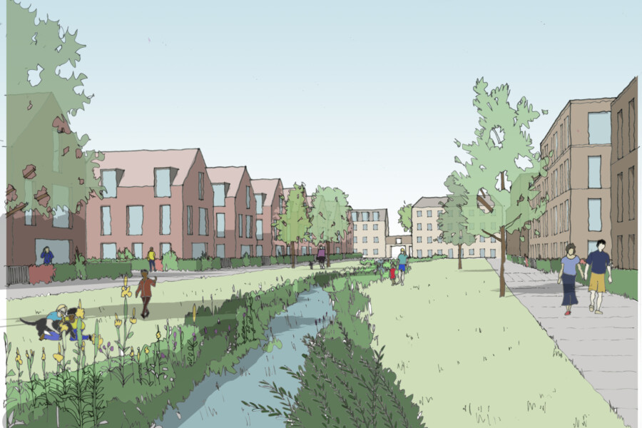
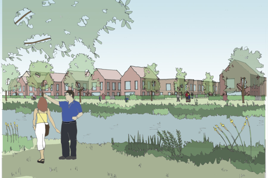
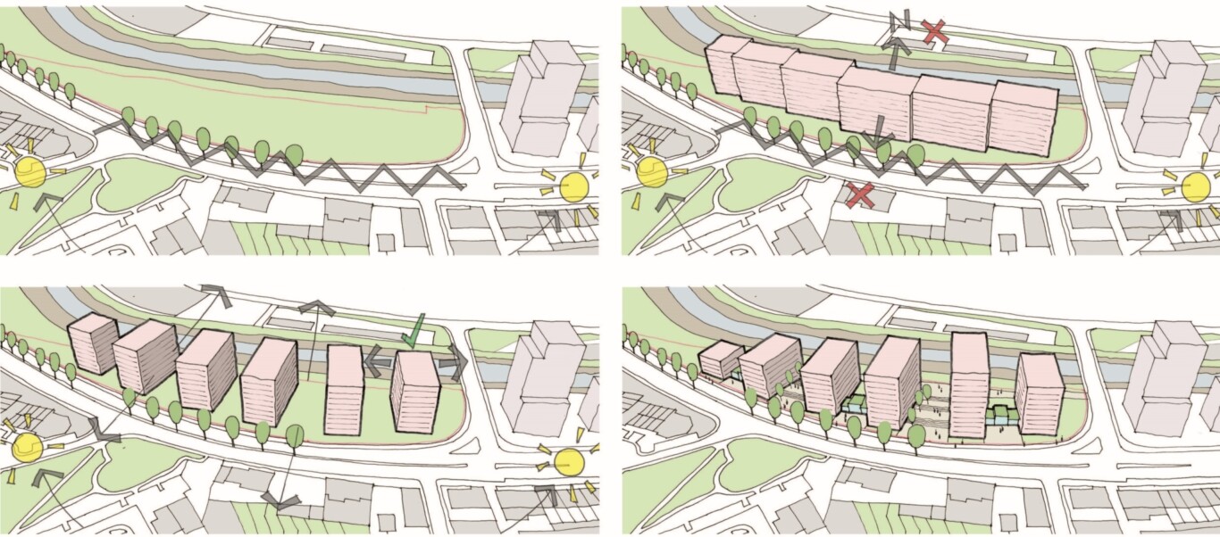
Often, the most effective way of communicating can be an almost cartoonish diagram which captures the imagination and highlights aspects of the design much better than a straight sketch of a building. For example, for the Avon Street and Freestone Road student housing developments in Bristol, I produced quick, diagrammatic, cartoon-type representations of the project visions and we presented them to the clients – those diagrams captured the imaginations of the clients and they were very excited to explore the ideas, which led to us being awarded those two projects.
The vibrancy of the same cartoon style of diagrammatic representation also won us a riverside residential project in Bristol. Presenting a finished CAD drawing or CGI does not provide any insight into the creative process which led to the end product, which is why these diagrammatic sketches are so important; they convey the essence of the design vision and the strength of the idea behind it.
How do you see your sketching process evolving?
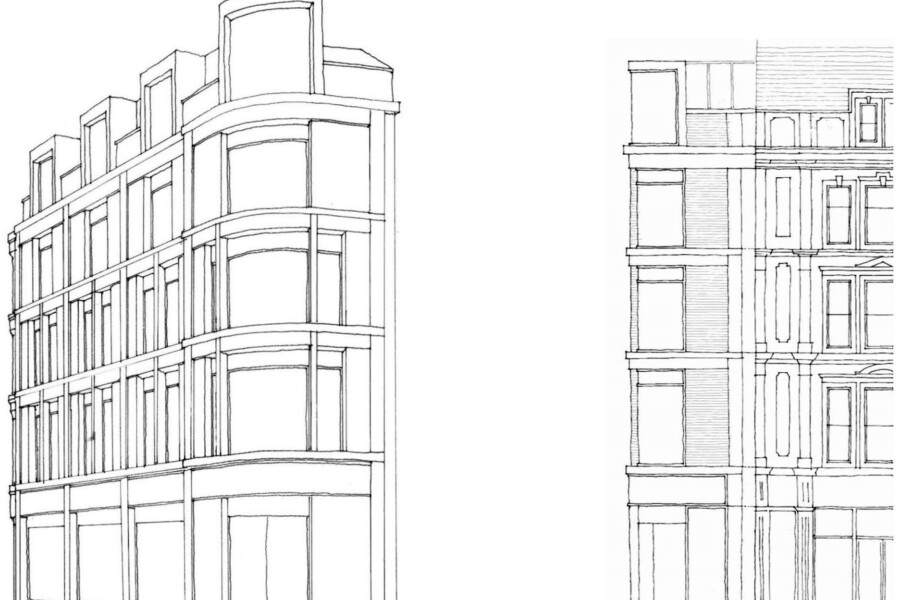
I am passionate about learning and using the most effective ways to visually communicate, whether that be sketching or any other design tool. I read widely and look for examples of new ideas, techniques and technologies and have collected a store of visualisations which I use as inspiration in my own work. It may be that the example is not something that I would directly use, but rather that I have identified an element of the way in which it successfully communicates a particular idea or message. I often draw upon this library of ideas when working on projects.
I don’t have a signature style of my own, but instead draw from a collage of styles that I have seen and which I think work well. Precisely because I am not inherently gifted in drawing, I look around at the styles and techniques of others and use them as reference points if I think they can be of use, and appropriate, in a given context.
You mentioned that you had to work at sketching rather than being innately talented at it. Do you actually enjoy sketching?
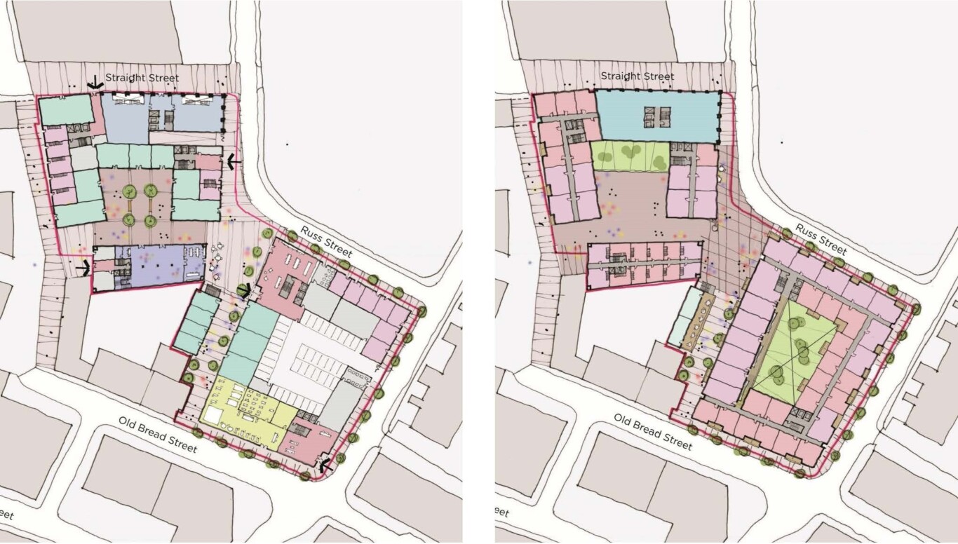
I do. There are two parts to my drawing – the sketching I do when I am designing, which is very loose and free-hand, and the more precise sketching I do for presentations, which are often diagrams, plans and 3D visualisations – the latter type is more challenging because they have to be more controlled and don’t allow for the level of playful creativity you might have using a fat pen to push ideas around.
However, I still enjoy the process and get great satisfaction from working out what needs to be communicated, building up the drawing layers and emphasising the key elements. It is rewarding to look at the drawing and to know that I have successfully and effectively conveyed the vision.
However, I still enjoy the process and get great satisfaction from working out what needs to be communicated, building up the drawing layers and emphasising the key elements. It is rewarding to look at the drawing and to know that I have successfully and effectively conveyed the vision.
