Project Profile: Creating Wuppertal’s most important post-war urban transformation at City Plaza
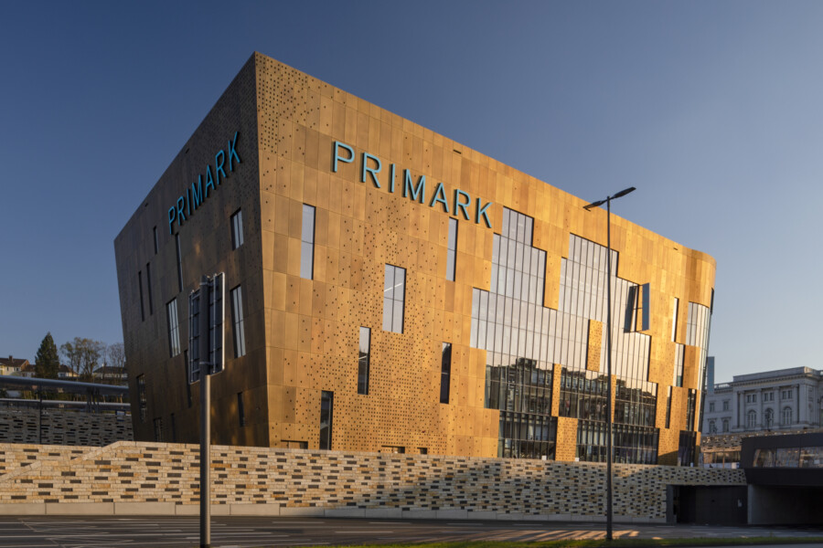
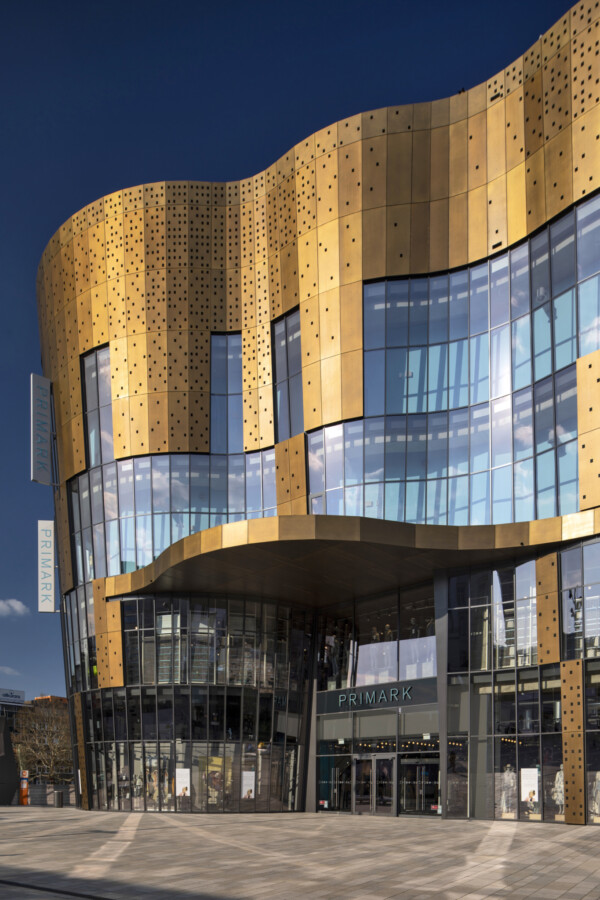
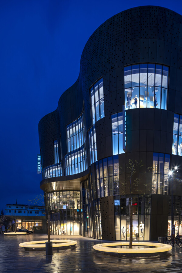
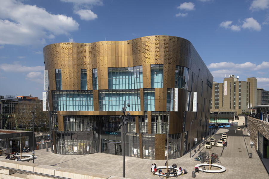
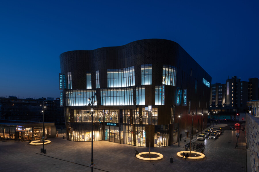
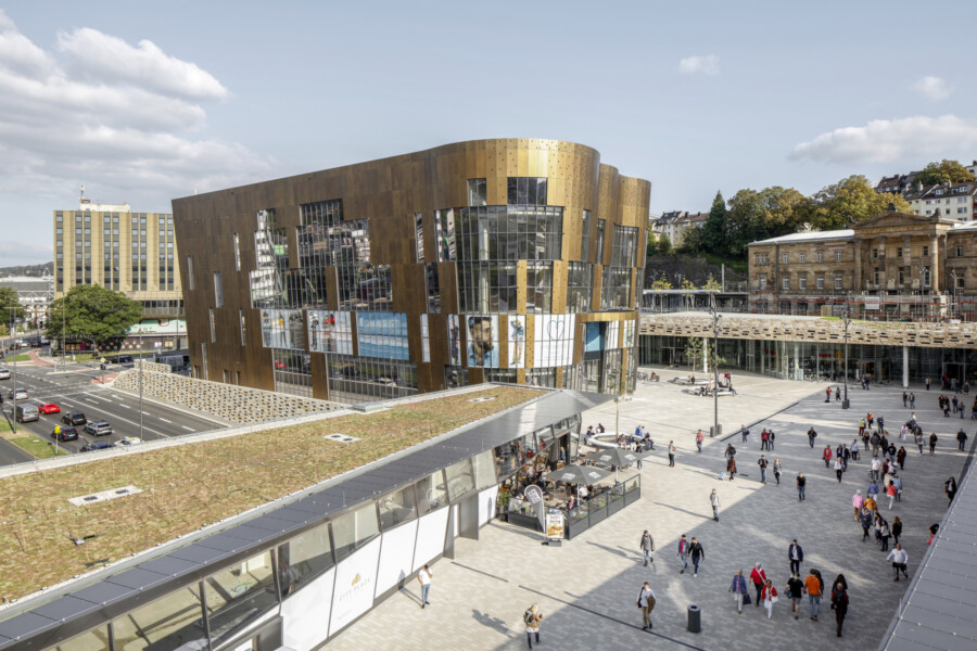
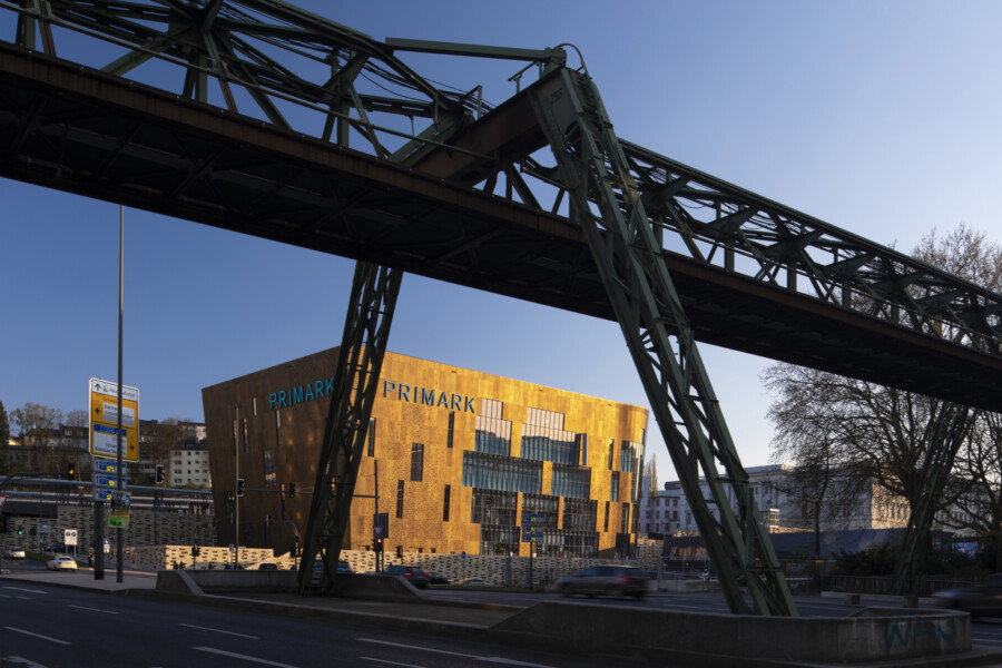
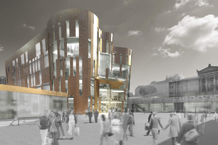
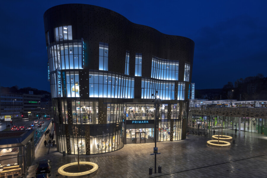
City Plaza, the centrepiece of a large urban redevelopment project which links Wuppertal’s railway station to the town centre, opened to the public on 16 April, welcoming over 1,000 visitors in its first hour. The building, a five-storey flagship store for Primark, marks the rail gateway to Wuppertal’s city centre, and defines the remodelled square in front of the railway station. City Plaza’s curved façade is clad with brass panels alternating with glass to create a striking ‘curtain wall’, lifting the area's look and feel alongside the major improvements to the surrounding public realm.
Chapman Taylor’s Düsseldorf studio, together with the investor, Signature Capital, won a prestigious German Polis Award for City Plaza in the ‘Regenerated Town Centres’ category in 2016. In this profile of the development, Chapman Taylor Director Jens Siegfried and the City Plaza Project Architect Yvonne von Salm tell us about the project’s inception, the challenges it has presented and the great transformation it is bringing to Wuppertal city centre.
Tell us about how Chapman Taylor became involved with City Plaza.
JS: We had previously worked for the client, Signature Capital, on their redevelopment of the famous Neumarkt Galerie shopping centre in Cologne, which we had also originally designed in the late 1990s. A major part of the redevelopment included the integration of the largest Primark store in Germany. That was Signature Capital’s first major project in Germany, and Yvonne worked very closely with the client’s team, advising them on all planning and building-related aspects they needed to know for a retail scheme of that size and complexity within the German system.
At that same time, the City of Wuppertal opened a bid competition for a new redevelopment of the area between Wuppertal city centre and the city’s railway station, and Signature Capital asked us if we would be interested in developing an existing urban design scheme, created by another company, for them to enter.
What did you change about that design?
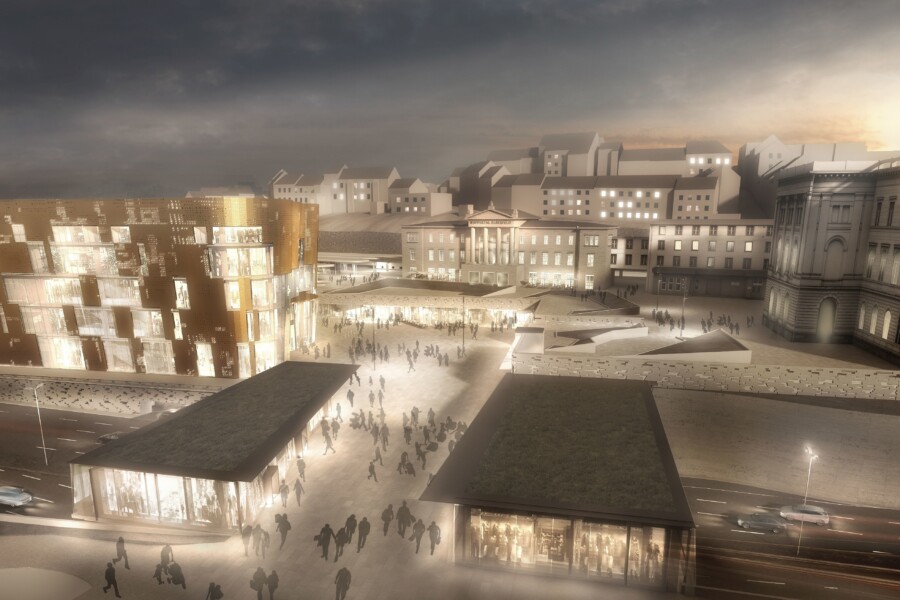
YVS: We changed the design substantially. We reduced the size of the square in front of the railway station and created a much more human scale – for example by proposing the relocation of the main building to bring it into closer focus.
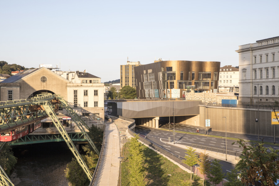
Rather than a simple pedestrian bridge from the square to the station, we suggested a wider bridge with retail/F&B pavilions on either side. Previously, the railway station was cut off from the town centre by a busy dual carriageway and pedestrians had to walk through an unwelcoming underpass – the new pavilion bridge, now open, transforms the pedestrian experience and seamlessly links the station with the city centre. Pedestrians crossing the new bridge barely sense that they are crossing a dual carriageway.
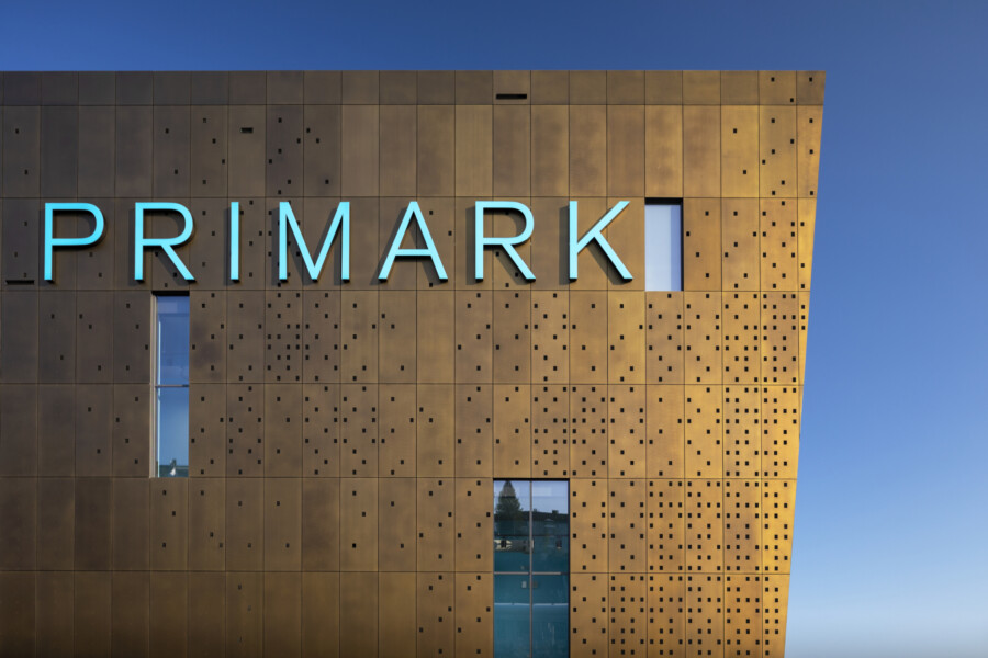
Our design for the main building was inspired by Wuppertal’s strong association with the textile industry, which made the city rich and powerful in the 17th and 18th centuries. We decided to create a multiply curved façade, leaning outwards at the upper levels by 4.6% (a total of 2m overall), which resembles the folds of curtains. The façade materials were very expensive – the façade is clad with brass panels alternating with glazing, creating a landmark focal point for the new plaza. The building coating was done by hand and cost over €500 per square metre – Signature Capital was determined to pay for the highest quality so that the building would become an icon for the city as well as providing a reference development to show to other cities in which Signature may choose to invest.
What is the main building’s purpose?
YVS: The original idea was for it to house a number of retail tenants and a hotel across its five above-ground floors. It was subsequently leased by Primark to house a flagship store – the building is of such a high quality that it serves as a statement of intent, enabling Primark to raise its profile in Germany and reposition itself in the market.
Tell us some more about the design for the wider urban realm
JS: The pavilion-lined bridge design was created through an internal Chapman Taylor competition across a number of our international design studios, which our studio (Düsseldorf) happened to win (there was an independent jury!). The winning design is a steel construction which makes use of folded glass panels. Our design was implemented and the pavilions are now fully let and are operating (most are F&B brands, with one fashion retail outlet).
YVS: There are a number of historic buildings nearby, but we wanted to present Wuppertal as a vibrant blend of the old and the new – the contemporary design for City Plaza helps to achieve that in a way which still complements the wider urban landscape.
Tell us about the major challenges the scheme presented.
YVS: The transformative nature of the project meant that opinion was divided on the scheme, particularly the building, so we made a lot of presentations to the public, to political parties and to the local authorities to explain the scheme’s importance and the positive long-term benefits it will bring to the city. The City of Wuppertal itself was fully supportive, appreciating the once-in-a-generation opportunity to create a high-quality connection from the railway station to the urban core of the city.
In terms of design, the curved and slanting façade of the building was a challenge – if it wasn’t for our BIM capabilities, it might not have been possible. We had to design each individual panel with care because there couldn’t be a uniform size and shape, and each panel has a unique perforation to create a pattern. Therefore, each panel was numbered and allocated to its own position on the façade. This was a very complex process. We designed the whole building in BIM, and the other contractors were able to make use of our model – simplifying the process, preventing clashes and saving a lot of time on the development.
JS: A major construction challenge was that the site is on top of rock, which had to be dynamited away to allow for an underground level of car parking, service access and other facilities. This was a time-consuming and tricky process, and was also expensive. The dual carriageway also had to be lowered to facilitate the bridge. The City of Wuppertal and the Landtag (regional government) of North Rhine-Westphalia invested €150 million to assist this process so that there could be a seamless transition for pedestrians between the city centre and the railway station via City Plaza.
How has the design been received?
JS: City Plaza has a daring design, but most people are very happy with it, and it has been highly praised in the architectural press. The wider renewal scheme received the Polis Award for ‘Regenerated Town Centres’ in 2016.
The owners of Primark have been over to visit from Ireland and they love the building, while the public is seeing the great improvement that the scheme has brought about. They now have the ability to walk between the railway station and the city in a seamless and much more pleasant way, and they can also see the way in which the square’s proportions have become much more human in scale. There has been very positive feedback.
City Plaza has become a key reference for discussions about how to regenerate urban centres during a period of uncertainty about the future of physical retail. At a recent retail conference in Düsseldorf, the attendees were brought in buses to see City Plaza – it was held up as an example of how a commercial scheme can thrive if it is a substantial improvement on what went before and positively transforms a built space. The whole urban setting has changed for the better.
What do you take most satisfaction from now that the project is close to completion?
YVS: The building itself is very satisfying because of its ‘Wow’ factor, but it’s the improvement of the whole area which is most pleasing. It creates new possibilities – people now dwell and watch the world go by over a coffee or wander around exploring in a space which was previously grubby, seedy and functional. It’s now a positive experience just to stand there and look around, and to appreciate the new sense of place that the design has created. That, for me, is the standout achievement.
Key facts:
Sectors: Retail
Services: Architecture
Client: Signature Capital
Area: 9,600m2 GBA
Status: Opened on 16 April 2019
Key Award: Winner of the prestigious 2016 Polis Award in the ‘Regenerated Town Centres’ category
For more information, please contact:
Yvonne von Salm
Senior Architect (Düsseldorf)
YvonSalm@chapmantaylor.com
