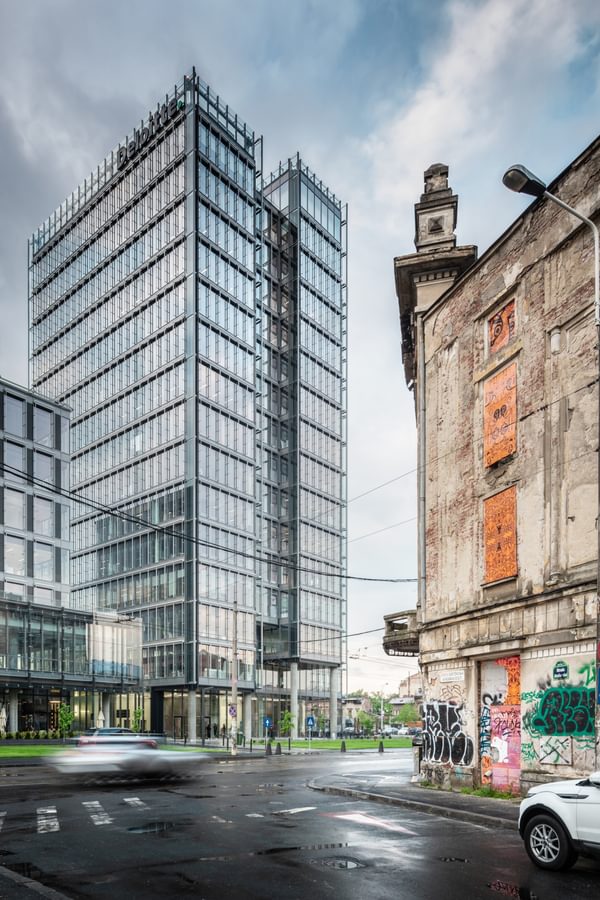
Project Profile: The Mark – highly sustainable workspace for blue-chip companies in Bucharest
Project Profile: The Mark – highly sustainable workspace for blue-chip companies in Bucharest
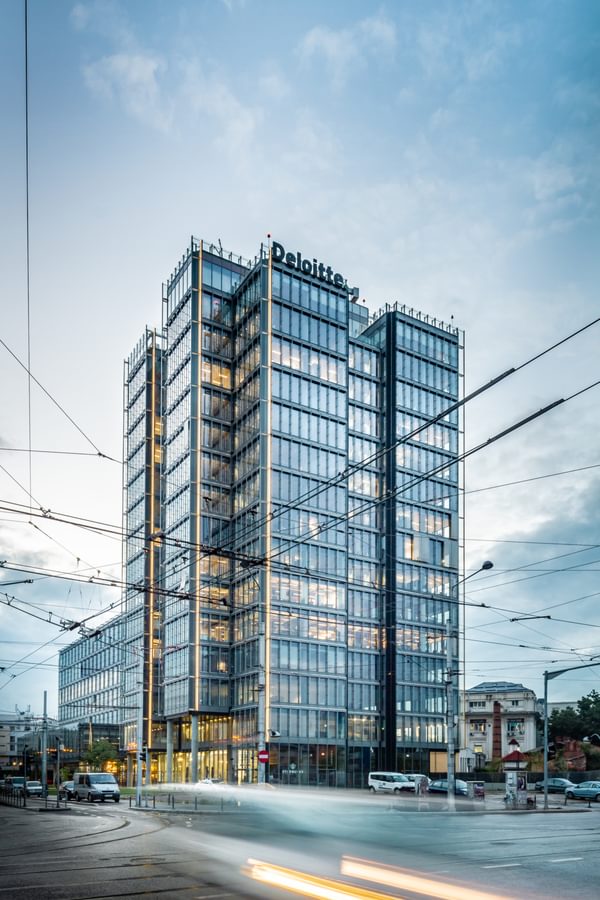
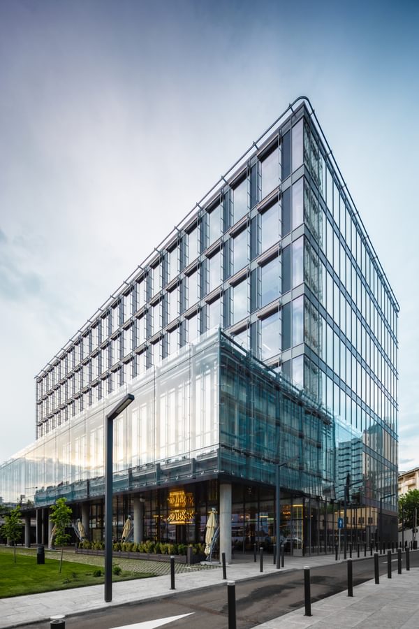
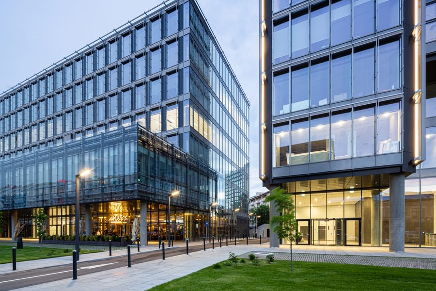
The Mark is a Class A office scheme near Bucharest city centre, close to the Gara de Nord railway station. Comprising two buildings, the complex contains a 15-storey tower and a six-floor podium, with a total of 28,000m2 above ground and 12,500m2 of underground space including 297 car parking spaces. The offices are rated BREEAM Excellent for sustainability, and offer high-quality user space served by high-speed lifts and excellent access to Bucharest’s public transport links.
Chapman Taylor was the Lead Designer on this project, involved from concept development through to tender. It also acted as Design Consultant on behalf of the client, S IMMO AG, in relation to site monitoring and design specification clarification. In this profile piece, Associate Director Igor Bergmann talks about the process of designing this highly sustainable and state-of-the-art workplace for blue-chip companies.
Tell us about the origins and location of the scheme.
We had previously worked with the client, S IMMO, on the successful Sun Plaza shopping and leisure project, which opened in Bucharest in 2010. S IMMO bought a site to the west of Bucharest city centre, near Gara de Nord railway station, and obtained a planning permit. It then asked Chapman Taylor to take the role of Lead Architect on the project - the buildings’ volumes and positions were therefore already delineated when we began to consider the design.
The brief was to create three concept options for the development, all with a strong emphasis on low energy consumption, and we worked very closely with Arup, which led on elements such as the MEP and façade, to evaluate various options for each concept we created. Each option would have different consequences for the MEP, shaft, façade, return on investment, running costs, etc – based on these factors, the client chose the design option which was focused on achieving BREEAM Excellent sustainability status.
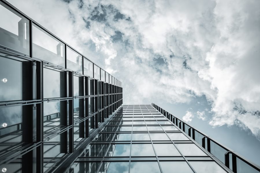
Our volumetric concept for the tower building was designed as an interpretation of a untidy bookcase, with varying books heights. The façade uses materials to express the building’s functions honestly through glass, aluminium, exposed concrete and stainless steel.
The overhanging façade softens the building’s corners, with a similar approach to the roof – giving the impression of the building blending seamlessly with the sky. These façade features are softly lit in a way which accentuates the building crown, while an enclosed shading system is able to double as a cinematic canvas on which images can be projected for events. Each sun protection louvre is connected individually to the building management system and can be operated to create an interesting kinetic art performance.
The selected concept makes use of white lighting systems, both interior and exterior, black and white colour theme for interior spaces as a design reference to the old films shown at the cinema that once existed on the site.
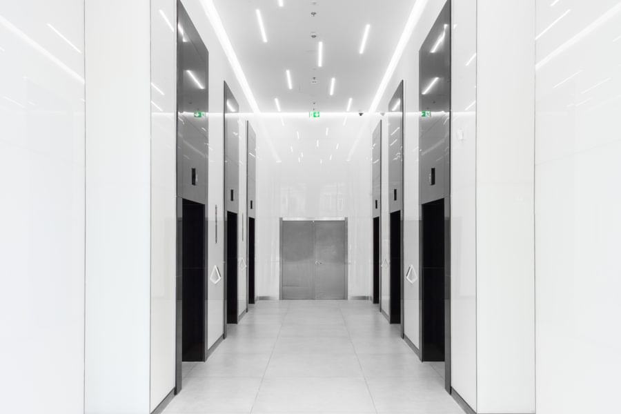
We adopted a very minimalist approach for the interior design, using a combination of stone and coloured glass wall cladding with white ceilings and large ceramic floor tiles. The wayfinding signage for the entire building was created by artist Aldo Giannotti, with original and unique hand-drawn sketches on each floor. The buildings are not just functional and efficient, but also great fun to spend time in.
What challenges did the site present?
The site is quite narrow, yet the buildings’ volumes are large, so we had to incorporate three basement levels – this was not easy, given the site’s central location within the city. This required a lot of strutting work to reinforce the underground section.
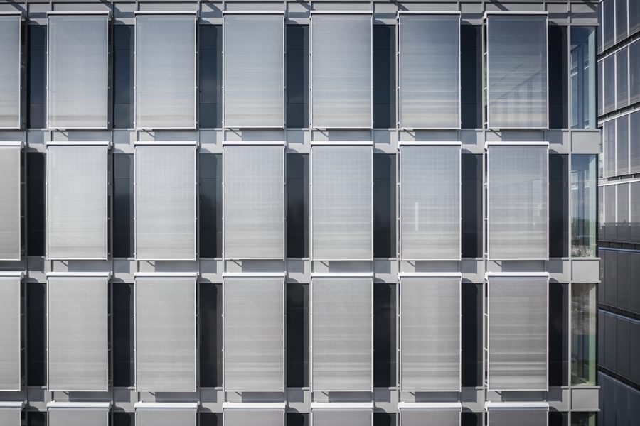
We wanted to maximise the amount of natural light received throughout the building, but had to reconcile this aim with minimising solar heat gains and avoiding high cooling costs during the summer months. Therefore, we designed the building with extensive glazing throughout to maximise natural light, but complemented by an innovative type of external shading, along with internal blinds for extra control of light levels by the buildings’ users.
The development is quite tall, and Bucharest can experience very strong winds, so we decided to implement a solution to solar heat gains which is rarely used in Europe, with just a few examples in Germany. Stainless steel mesh rolled blinds were installed, giving great protection against soar gains while allowing great views from the building when the louvres are down.
In addition, Bucharest is in a seismically active region, so the building had to be earthquake-proofed. We didn’t want any sheer walls on the façade, or cross-bracing, so the seismic load is borne by the buildings’ columns and the heavy central core.
How did you design for optimum environmental sustainability and wellbeing?
Our design focused on the needs of end-users, including their physical and mental wellbeing – encouraging collaboration, movement and relaxation while allowing in abundant natural light.
The buildings make use of energy-efficient lighting and a fully integrated lighting control system to minimise energy consumption, as well as infra-red sensor-fitted appliances in the WC facilities. In addition, we used solar technology for sustainable energy creation, with the podium roof substantially covered by solar panels.
There are excellent facilities for cyclists, including bicycle storage and changing rooms. There is also easy access to Bucharest’s public transport links, encouraging people to leave their cars at home.
The development includes biodiverse garden spaces; the site is quite compact, but we tried to ensure that we added soft landscaping wherever possible. The buildings host a number of terraces and balconies at each level so that people can step outside without having to travel to the ground floor.
Who are the tenants at The Mark?
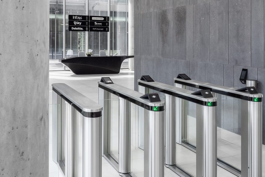
Deloitte has taken the sixth floor of the tower, with the rest of the tower let to law firms and IT companies, while the podium has been leased by the world’s largest advertising company, WPP.
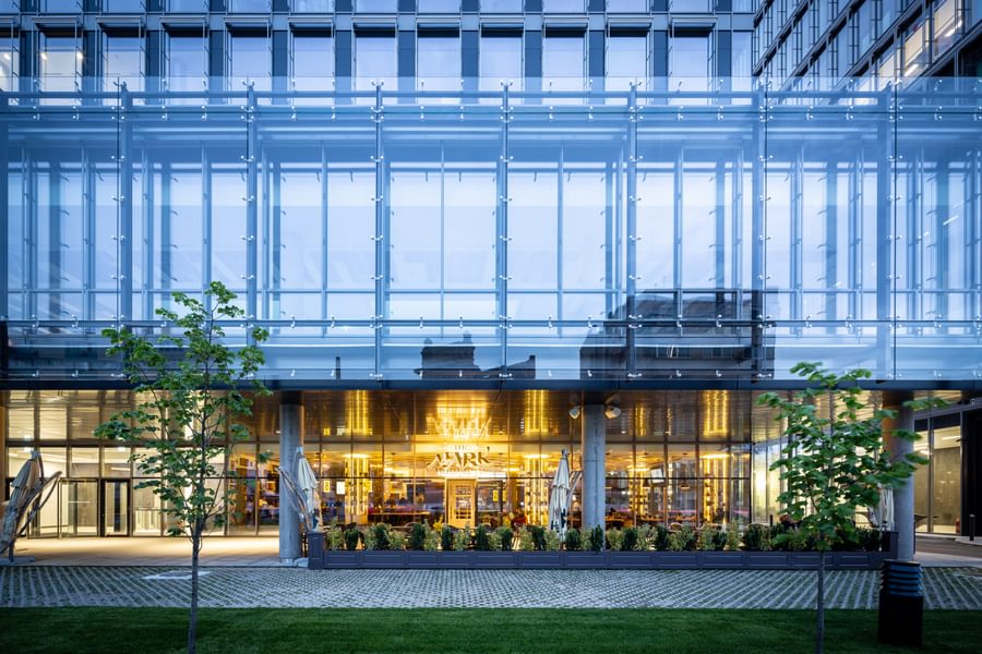
The tower’s ground floor hosts a large entrance foyer and some retail and F&B space for use by The Mark’s occupants and local people, providing an active frontage for the development. The first floor is now operated by a co-working company. The first floor of the podium building has a larger ceiling height to allow flexibility of use, while a double-skin façade protects the internal space from solar heat gains and noise from the street trams.
We designed with flexibility in mind so that the buildings can be easily adapted to changing requirements. For example, the tower building, which has relatively small floorplates, was designed around a central core which hosts the bathroom spaces, while in the podium, with its larger floorplates, bathrooms are directly connected to the tenant spaces and tenants can tailor the type of finishing of those spaces to their budget and interior design preferences. The way the shaft accommodates the bathroom spaces was designed to easily adapt to changes in tenancy formats, so that bathrooms can expand or shrink to suit the number of tenants on a given floor.
How has the client reacted to the completed development?
S IMMO is very happy with the finished scheme, particularly because the running costs are even lower than they aimed for. The cooling and energy systems we have created are more efficient than we had anticipated, which has further enhanced the reputation of The Mark as an environmentally sustainable scheme.
The client is also delighted with the design, which creates an elegant, minimalist and aesthetically pleasing landmark for this district of Bucharest. They gave us lot of freedom in our design and provided valuable ideas during the design process. The finished complex helps to upgrade the area’s appearance and consolidate its position as the city’s prime commercial district. On the basis of this successful development, S IMMO is now exploring two further developments with us, in Romania and in Hungary.
For me, The Mark has been a career highlight. I was able to design this project without having to make major compromises, and the building is my tribute to the British high-tech and minimalist architectural pioneers who greatly influenced me during my studies. The project took more than six years to complete because of interruptions caused by the economic downturn, so it is immensely gratifying to see the building finished and occupied.
What did your site monitoring role involve?
The site contractor created execution drawings for the construction phases, and our role was to review every single drawing produced in fine detail, including MEP and structural drawings (in collaboration with specialists in those elements). We also reviewed mock-ups of the interiors, façade and other features.
The main purpose of our monitoring position was to act as design guardian, ensuring that there was no fundamental divergence from the agreed design. We were mostly focused on the final overall appearance of the building, but we paid attention to the detail of all components, down to stepping in with recommendations for aesthetically suitable grilles, for example. We had on-site meetings every two weeks to monitor progress as construction advanced.
Who are the tenants at The Mark?
Deloitte has taken the sixth floor of the tower, with the rest of the tower let to law firms and IT companies, while the podium has been leased by the world’s largest advertising company, WPP.
The tower’s ground floor hosts a large entrance foyer and some retail and F&B space for use by The Mark’s occupants and local people, providing an active frontage for the development. The first floor is now operated by a co-working company. The first floor of the podium building has a larger ceiling height to allow flexibility of use, while a double-skin façade protects the internal space from solar heat gains and noise from the street trams.
We designed with flexibility in mind so that the buildings can be easily adapted to changing requirements. For example, the tower building, which has relatively small floorplates, was designed around a central core which hosts the bathroom spaces, while in the podium, with its larger floorplates, bathrooms are directly connected to the tenant spaces and tenants can tailor the type of finishing of those spaces to their budget and interior design preferences. The way the shaft accommodates the bathroom spaces was designed to easily adapt to changes in tenancy formats, so that bathrooms can expand or shrink to suit the number of tenants on a given floor.
How has the client reacted to the completed development?
S IMMO is very happy with the finished scheme, particularly because the running costs are even lower than they aimed for. The cooling and energy systems we have created are more efficient than we had anticipated, which has further enhanced the reputation of The Mark as an environmentally sustainable scheme.
The client is also delighted with the design, which creates an elegant, minimalist and aesthetically pleasing landmark for this district of Bucharest. They gave us lot of freedom in our design and provided valuable ideas during the design process. The finished complex helps to upgrade the area’s appearance and consolidate its position as the city’s prime commercial district. On the basis of this successful development, S IMMO is now exploring two further developments with us, in Romania and in Hungary.
For me, The Mark has been a career highlight. I was able to design this project without having to make major compromises, and the building is my tribute to the British high-tech and minimalist architectural pioneers who greatly influenced me during my studies. The project took more than six years to complete because of interruptions caused by the economic downturn, so it is immensely gratifying to see the building finished and occupied.
Key facts:
Sectors: Office Services: Architecture, Interiors Client: S IMMO AG Area: 42,500m² GBA Status: Completed in 2019
