TresAguas: Redesigning a Madrid shopping centre to ensure its relevance in a challenging era
The refurbishment of TresAguas shopping centre in the Madrid district of Alcorcón was designed by Chapman Taylor to position the shopping centre as one of the top retail and leisure destinations in the city. Opened in 2002, the 66,000m2 TresAguas offers a varied mix of retail and leisure and attracts six million visitors a year. Among more than 150 brand names at the centre are Mango, Pull & Bear, Zara, Stradivarius and Massimo Dutti, complemented by a food court, a 3,600-seat multi-screen cinema and 3,000 parking spaces.
Chapman Taylor was asked to refurbish the centre by Merlin Properties and Grupo Alonso to provide it with a new identity and to ensure that it could compete effectively in a challenging time for retail-led offers. Chapman Taylor Architect Alfredo Sanz, from our Madrid studio, talks to us here about the objectives of the refurbishment, the ways in which the centre was made more welcoming and the positive reception the redesign has received from visitors.
What was the client brief for the refurbishment of TresAguas and what was your design approach?
The main brief laid down by the client required us to create a modern design which would:
- Create a single entrance to act as a focal point from the exterior. - Unify levels by creating a smooth flow between them. - Improve legibility. - Integrate the exterior and interior spaces. - Create a new information point. - Create a contemporary commercial identity and image. - Increase visibility in, and to, the mall. - Better organise the private areas and maximise the use of the available surface area. - Improve vertical communications, flows and signage. - Modernise the centre's lighting and accessibility
Our overarching approach to the refurbishment was to design an attractive environment as the backdrop for a unique and memorable visitor experience. Our design sought to create fresh, timeless, luminous spaces with seamless visual continuity between them, as well as providing a contemporary character.
The prior analysis we conducted was fundamental to the success of our redesign – understanding the space, volumes, light and various routes was a critical element in achieving what the client wanted.
Having assessed the building in terms of its visual presence in the urban landscape, we judged that the exterior of the building lacked visual strength and decided that it was necessary to create a "call effect" – minimising or eliminating clutter and confusing elements and creating a direct and simple visual and commercial identity.
Another of our strategies was to upgrade and integrate the overloaded areas of the centre through new lighting and a colour palette chosen specially to help forge a new commercial new identity. In addition, for the external environment, we wanted to create an attractive and pleasant space for walking and relaxing which would help encourage visitors to enjoy a longer and more pleasant stay.
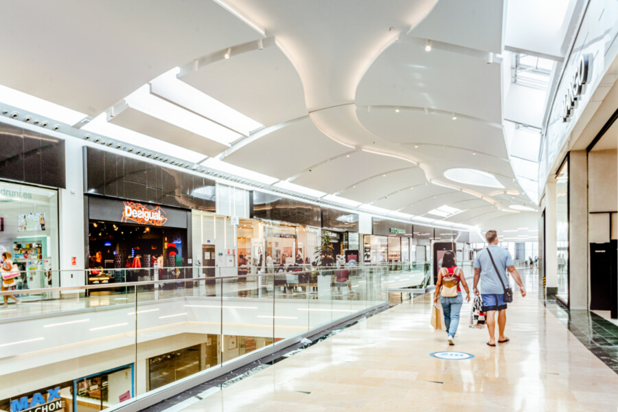
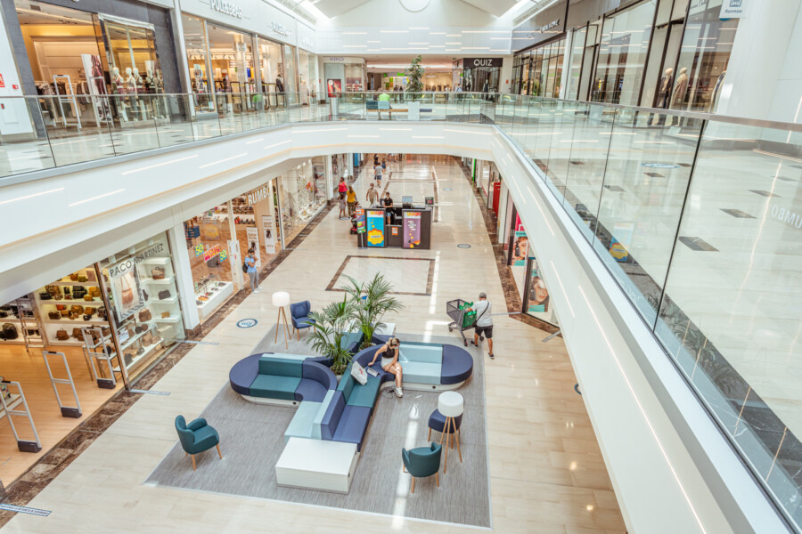
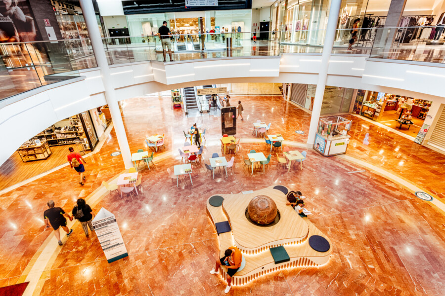
For the interiors, the main objective of the redesign was to unify the style of the shopping centre and create a unique and modern commercial identity through high-quality design and the use of suitable materials. Our renovation also aimed to greatly improve the commercial flow and to provide excellent visibility between the ground and top floors.
How did you make the centre more attractive and welcoming?
It was necessary to break with the centre’s outdated image, so we used new materials and colours and created a new lighting scheme with an intelligent balance of natural and artificial light.
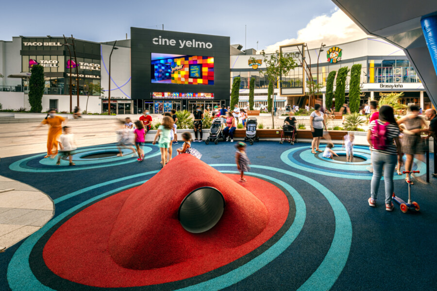
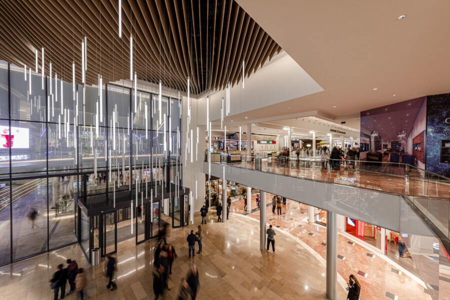
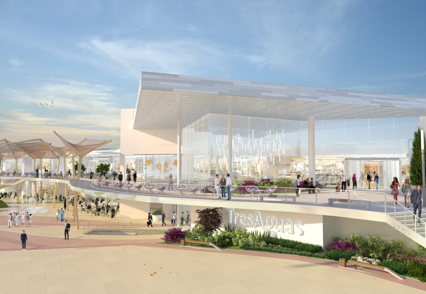
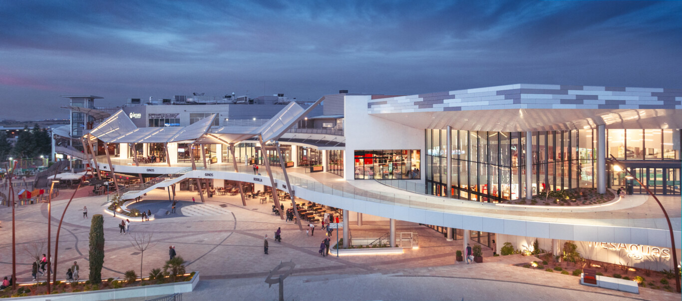
The main entrance has been redesigned, with a large glass-enclosed lobby that fills the interior of the centre with natural light and provides visibility to the shops from outside. The central plaza opens towards the new main entrance, creating a more seamless transition between the interior and exterior spaces. The spectacular new entrance provides an external focal point and promotes the building’s visual legibility. Meanwhile, the façade of the building’s cinema complex has also been transformed by a large and striking LED screen.
To aid views to the centre, we chose to use glass railings, maximising the visibility of the various tenants from much further away. The shopfronts themselves were also renewed, providing them with maximum transparency, improving the design of the windows and creating open access. The centre’s interior and exterior lighting, as well as that of the shops, was renewed to further enhance transparency, while the internal common areas were modernised and decluttered to improve horizontal and vertical visibility.
In addition, the renovation allowed Mango to quadruple its space in the centre, while Stradivarius and Massimo Dutti also extended and renovated their premises. The redesign also attracted new brands to TresAguas, such as H&M.
A new balcony runs along the west façade connecting the north and south sides at the upper level. We also created a new external terrace, parallel to the main façade, to be used as a food court seating space. The new terrace acts as a balcony over the square, providing a lively and dynamic space in which diners can enjoy a meal or a drink while people-watching.
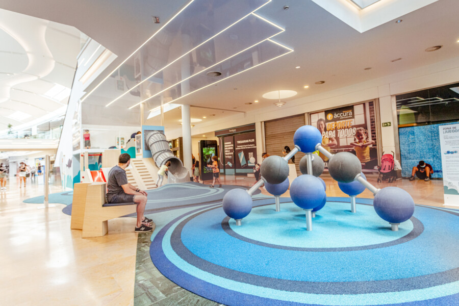
The central plaza has been transformed to become more open and modern, improving circulation flows between the leisure and fashion areas and the restaurant buildings. The square has been brightened up and made more vibrant with new flower boxes, seats, stages and children’s games. Its new paving, its fountain and the landscaping of the adjacent promenade have also been important elements in achieving a welcoming and attractive space.
How has functionality been improved?
The new exterior frontages, which are higher, modern, innovative and full of character, combine with the bright and inviting interior light to create an easily legible and attractive destination, drawing people in and providing them with easy navigation. We also installed a new exterior ramp, with the elegant design making access easier and more direct.
Communication between the various buildings has been improved by remodelling the square and by the creation of the new main entrance, which provides the external focal point and invites entry to the centre.
Which element(s) of the redesign are most important for the future success of TresAguas?
The future success of TresAguas, the refurbishment of which was fully necessary due to the age of the centre and the need to provide a new sense of identity and purpose, will, in large part, be down to our design providing the basis for new experiences and business opportunities as well as a completely different atmosphere. The refurbishment has already attracted new investors and operators to TresAguas, further broadening its range of services – especially F&B brands.
The improved functionality and the more diverse offers will help ensure the centre’s social and economic sustainability by encouraging people to stay longer and spend more as well as by drawing them back for repeat visits. It is no longer just a place where people come to buy something and then leave; it is now a place to meet people, socialise and enjoy the community experience.
What has the visitor reaction been?
The feedback from those who have visited the centre has overwhelmingly been that they greatly enjoy the improved look and the broader range of offers. In particular, the perception of the centre has been massively improved by the elimination of physical and visual clutter, which prevented people from fully enjoying the spaces, both inside and outside the centre.
Above all, visitors express their appreciation of the transformed atmosphere brought about by the radical change in the centre and in its surroundings. We believe that the transformation will give TresAguas a brand new sense of purpose and create a community focal point, helping to establish the centre as one of the best retail and leisure destinations in the Spanish capital.
