查普门泰勒品牌重塑及网站设计 Location City: 伦敦总部
A dynamic approach to the challenge of rebranding a contemporary architectural practice
Key Info
- Scope:
- Concept development, design, artwork and implementation for the brand identity, website, and brand applications
- Branding:
- Full suite of marketing collateral, brand assets and guidelines
- Website:
- Bespoke, fully responsive website design
- Applications:
- Marketing collateral, promotional items, digital applications, office signage and internal marketing
- Launched:
- 2017
Map Location
The vision for a new Chapman Taylor
Since its inception in 1959, Chapman Taylor has evolved from being a London-based architectural practice to a diverse global design group today. In response to this transformation, we began a process of redefining our values and creating a new understanding of who we are as a practice that would both honour our heritage and forge a new approach to the challenges of the future.
Inspired by our global network
The outcome has been the creation of a new brand and visual identity for Chapman Taylor, which is designed to encapsulate the diversity of our projects, people, clients, locations, sectors and studio locations. To highlight what makes us unique as a practice, we turned to our global reach for inspiration. Using the locations of our studios around the world, we built a 3 dimensional model of our global network, creating a distinctive, multi-faceted polyhedron that has become central to our new visual identity.
Taking a generative approach
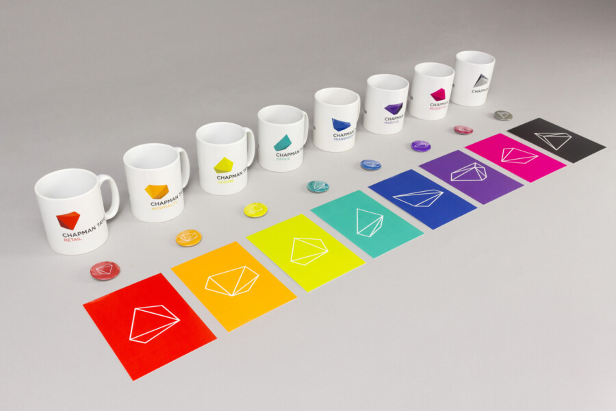
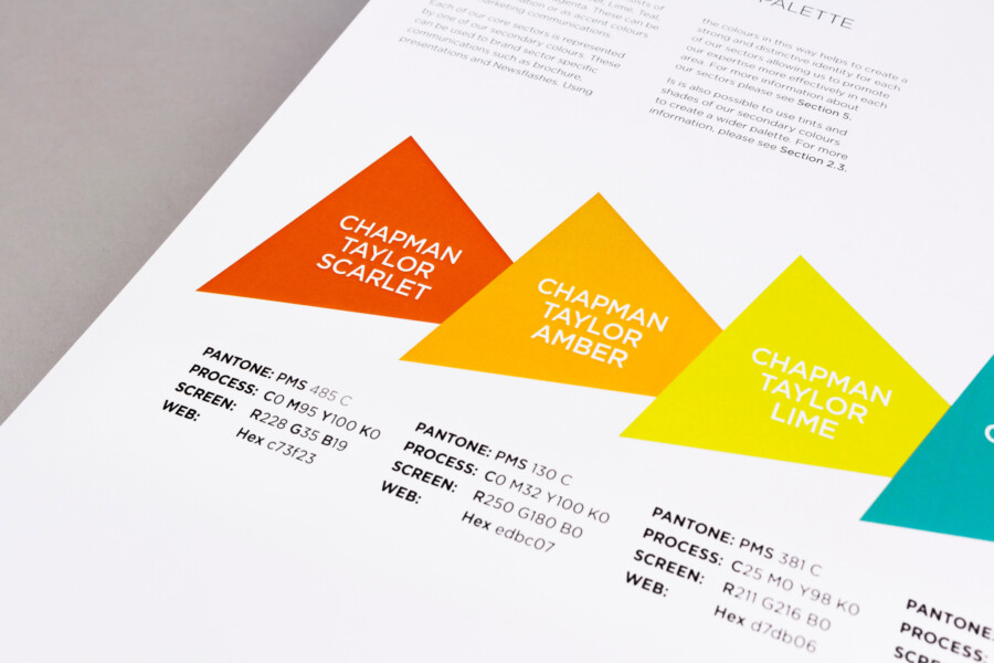
By using a 3-dimensional approach, an infinite number of forms can be generated from different views of the polyhedron. A selection of these shapes have been used to create our company logo and identities for our core sectors. Each sector is also distinguished using a colour from our secondary colour palette and, alongside our corporate typeface, they create a coherent visual language for the brand, while still maintaining a distinctive identity for each of the sectors we work in.
A rich palette of materials and finishes
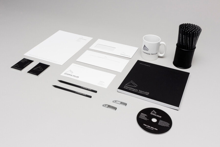
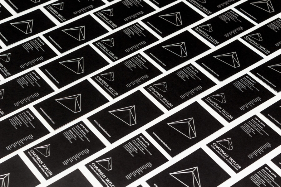
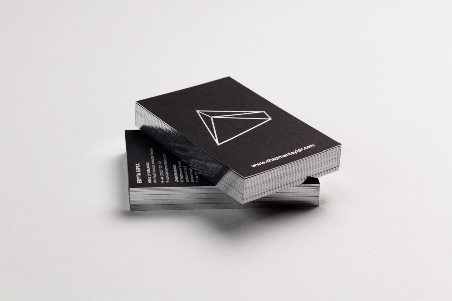
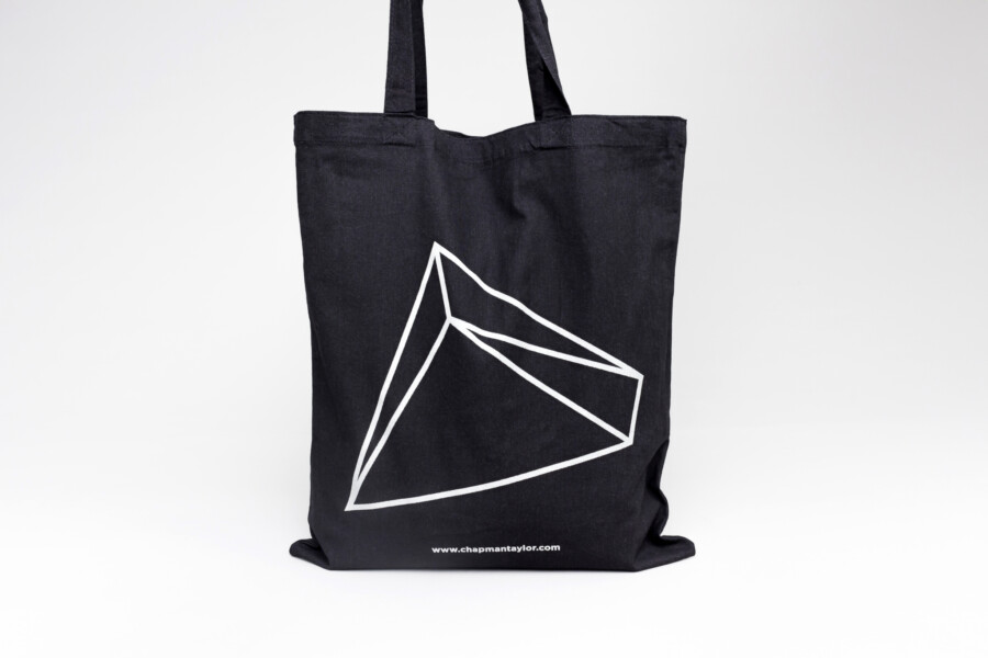
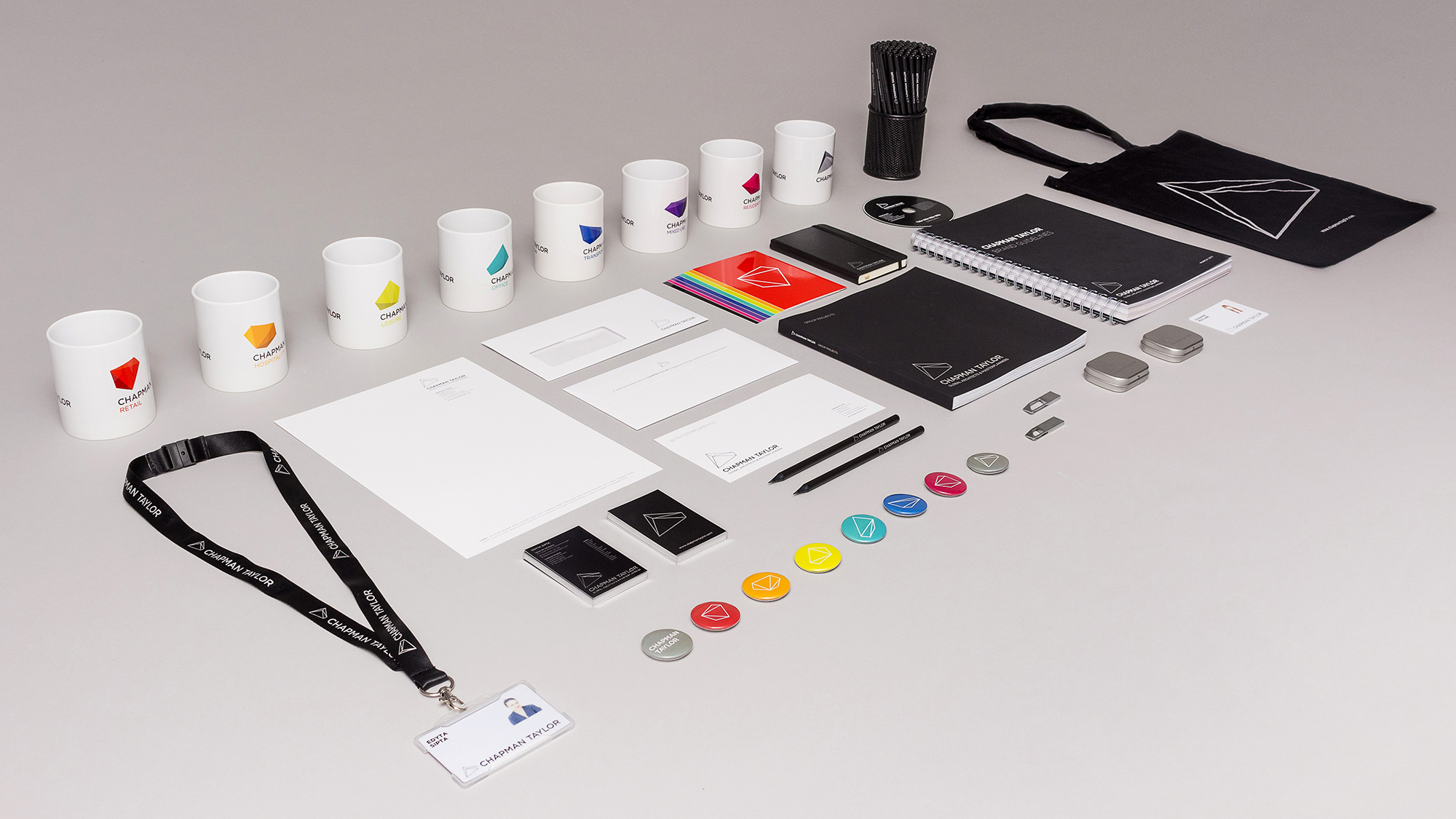
The flexible nature of the identity allows us to create designs for a wide range of applications and media. At a corporate level a full suite of stationery has been produced, employing black and silver foil on Fedrigoni stock. This is also complimented by our group brochure, office signage and a range of promotional items including tote bags, pencils, notebooks, USB sticks and umbrellas in our primary black and silver colour palette.
Promoting internal engagement
Alongside our printed marketing collateral we also developed a number of internal brand applications, allowing us to explore the creative potential of the new identity. These included internal email newsletters, coffee mugs for our studios, updated material for our internal groups and items for promoting the internal launch, held for staff across the group. The launch was also accompanied by the release of a comprehensive set of brand guidelines to support the use of our brand assets and artwork.
A new online presence
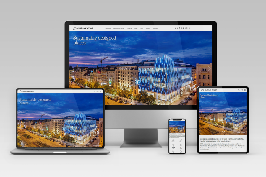
The introduction of the new Chapman Taylor brand has also been supported by the launch of a new company website. While developing the brand identity the Chapman Taylor Graphics Team also worked to comprehensively redevelop the practice’s online presence. This included developing the site structure and navigation, designing the pages and UI, creating artwork and digital assets and working closely with the external developers on the build.
More than just a new logo, our identity represents a dynamic and distinctive new brand for the practice, which celebrates the diversity of our projects and our people.
For more information please contact:
Edyta Sipta
Graphics (London)
T: +44 (0) 20 7371 3000
E: esipta@chapmantaylor.com
